
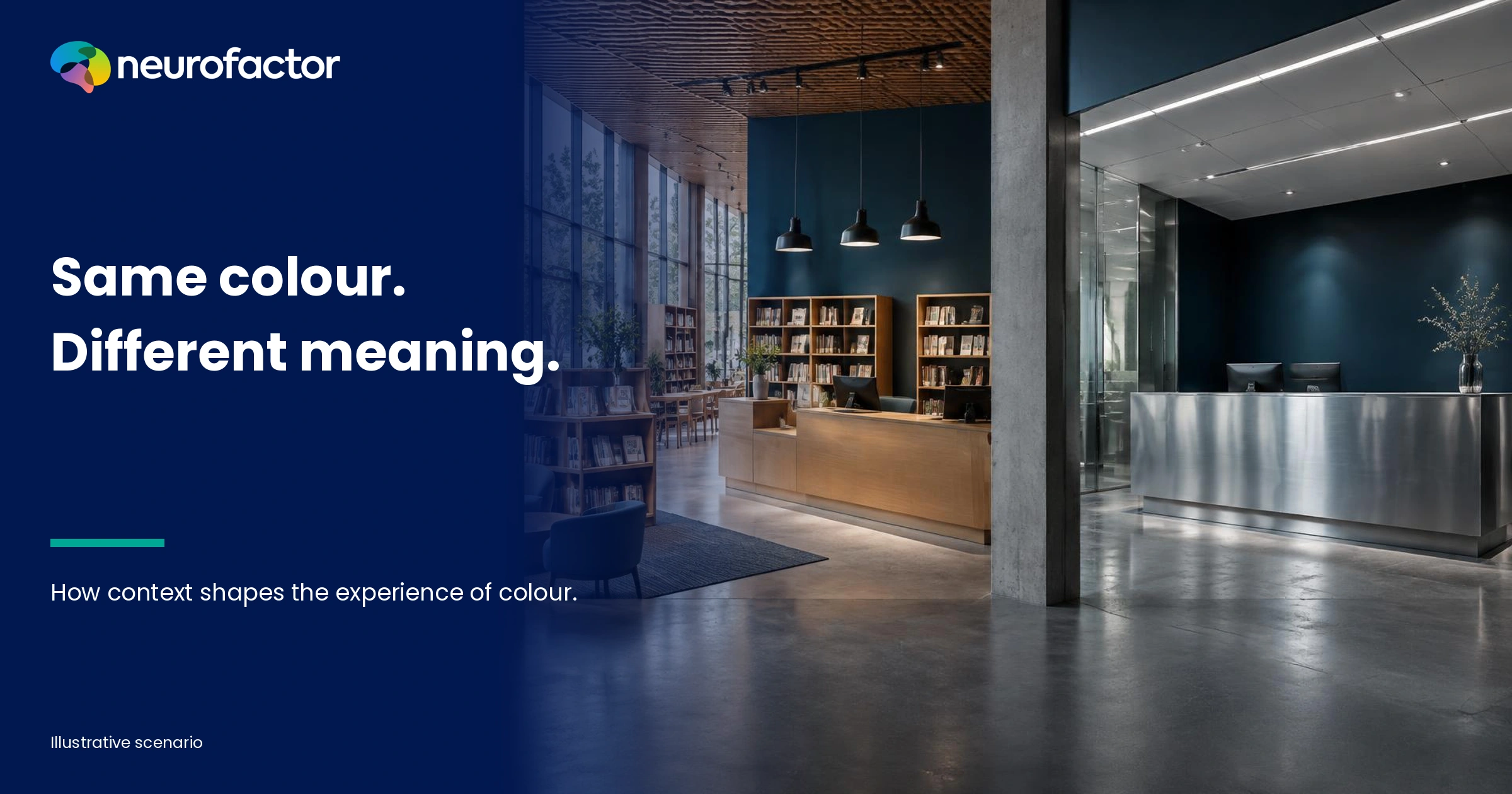
How do colour associations shape the experience of a space?
The new reception hall has exactly the palette the design team requested. Dark blue for trust, a warm accent for hospitality and neutral white to suggest calm. The presentation looked convincing. Yet when people arrive, some glance towards the exit, others search for the reception desk and still others call the room impressive but remote. A colour does not carry a fixed psychological meaning that can be applied independently of its surroundings. People connect colours with earlier experiences, the purpose of a space, its lighting, its materials and the task that brought them there. Anyone seeking to improve an experience through colour should therefore move beyond asking which colour 'creates calm'. The useful question is which associations a particular design produces for a particular audience - and whether the space becomes easier to understand, navigate and use.
The same blue wall can communicate welcome and distance
Colour advice often sounds wonderfully actionable. Blue means trust. Green means nature. Red means energy. The problem is that these claims treat colours as switches that activate the same feelings in everyone. Real physical environments do not work that way.
Imagine a hospital selecting dark blue for its reception area. Some visitors may associate the combination with expertise, cleanliness and an institution they recognise. For others, blue alongside a high counter, cool light and empty surfaces may contribute to an impression of distance. In a premium hotel a similar hue could fit an exclusive experience. Across an entire wall in a children's library it might make a reading corner feel less approachable. All of these are hypotheses to investigate, not established reactions of hospital visitors, hotel guests or children.
The interesting part is that a colour may be physically similar while the meaning of the situation changes. Visitors are asking, consciously or otherwise: am I welcome here? Where should I go? Is this place professional? May I touch anything? Can I find my destination independently? Colour contributes to those answers, but so do furniture, signage, sounds, people and prior expectations.
That is why 'Do people like this colour?' is too narrow a research question. An attractive room may be impractical. A quiet-looking room can be confusing. A strong corporate colour may create recognition on packaging yet dominate a wall when applied at full scale. We need to examine which expectation a palette creates, whether that expectation fits the setting, and what people subsequently do.
Differences can be substantial even within a supposedly uniform target audience. A first-time visitor needs more guidance than an employee who knows the building. Someone arriving late may look for a clear route; someone visiting for leisure may enjoy exploring subtle details. Assigning those reactions to age, job title or culture without testing them converts a plausible idea into an unsupported stereotype.
This matters commercially. A striking showroom can unintentionally imply higher prices or limited access. A beautifully designed gallery can make visitors hesitate at the doorway. A reassuring reception area can leave people unable to locate the right service. Colour is relevant only when the actual experience, not merely the presentation board, meets the design objective.
Image
One colour, different meanings in different settings
The following matrix is not a set of measured results. It identifies plausible interpretations to test in specific environments. Each row shows why a colour decision only becomes meaningful when connected to the task of that particular space.
A palette that sends an appropriate signal in one context may distract people in another. The table also reveals an important distinction: what a colour means and whether a place works are different questions. Visitors may call a room friendly while struggling to find the exit. Employees might dislike a colour yet complete their work without difficulty.
A single rating such as 'How pleasant is this colour?' is therefore insufficient evidence for an entire redesign. Start by identifying the environment's purpose and the outcome that matters. Perhaps the entrance must be recognisable without hesitation. Perhaps visitors need to navigate independently, staff need to maintain concentration or a showroom must communicate the brand without intimidating prospects. Those outcomes call for different tasks, stimuli, measures and design decisions.
Healthcare reception
- Intended message of the palette
- Competence and reassurance
- Possible alternative association
- Coldness or distance
- What should actually be investigated
- Do visitors know where to get help, and does the reception feel approachable?
Creative workplace
- Intended message of the palette
- Energy and individuality
- Possible alternative association
- Distraction or sensory overload
- What should actually be investigated
- How do task, work zone and tolerance for stimulation differ?
Museum
- Intended message of the palette
- Intrigue and exclusivity
- Possible alternative association
- Closed, intimidating or inaccessible
- What should actually be investigated
- Do visitors enter confidently and understand where to go?
Business showroom
- Intended message of the palette
- Premium technical reliability
- Possible alternative association
- Expensive or intimidating
- What should actually be investigated
- Does the colour support the proposition or raise perceived barriers?
Public library
- Intended message of the palette
- Warmth and welcome
- Possible alternative association
- Clutter or restlessness
- What should actually be investigated
- Can people distinguish study, children's and information areas?
Civic service building
- Intended message of the palette
- Clarity and recognisability
- Possible alternative association
- Harshness or impersonality
- What should actually be investigated
- Can people reach the right desk and understand essential information?
Image
What colour research actually tells us
Elliot and Maier's review explains how colour can carry meaning and how associations with affect, cognition and behaviour have been observed in particular settings. The authors also discuss methodological limitations, moderators, boundary conditions and the need for stronger evidence in real environments. Their conclusion does not license a universal interior-colour manual. [1]
In 2020, Jonauskaite and colleagues studied associations between twelve colour terms and twenty emotion concepts among 4,598 participants in thirty countries. The researchers found substantial similarities, but country, geography and language were also related to differences. Crucially, the experiment examined conceptual associations with colour names, not the long-term experience of coloured buildings or observed visitor behaviour. [2]
Palmer and Schloss proposed an ecological valence theory of colour preferences. In simplified terms, the objects and experiences people associate with colours may help explain how much they like those colours. This makes past experience relevant to a design hypothesis, while stopping short of explaining every individual's preference from one memory or event. [3]
Wilms and Oberfeld varied hue, saturation and brightness in a controlled experiment and observed that emotion ratings and certain physiological responses were shaped by more than hue alone. Interactions mattered. Participants viewed colour stimuli on a display; they were not navigating a real hospital, office or museum. That distinction limits direct claims about interiors. [4]
A 2024 study by Jonauskaite and colleagues involved 7,393 participants aged sixteen to 88 from 31 countries. Associations between colours and emotions showed broad similarities across ages, with some meaningful differences. The authors explicitly noted that further work should determine whether conceptual associations match what people actually feel when exposed to colours. [5]
Valdez and Mehrabian examined hue, lightness and saturation with standardised colour samples in 1994. Their findings reinforce the importance of more than one colour dimension, yet cannot be translated directly into guarantees for a building with changing lighting and multiple users. [6] Elliot's later historical review also addresses how research design and interpretation have varied across colour studies. [7]
Mehta and Zhu's well-known experiments reported task-specific differences in responses to red and blue in defined laboratory settings. The phrase task-specific is essential. Those results do not prove that a red conference room will raise accuracy or a blue workspace will improve creativity in everyday use. [8]
The defensible conclusion is that colour matters enough to investigate, not enough to predict a specific room's success from a colour name alone. Some studies examine colour words, others calibrated patches on screens, specific laboratory tasks or actual environments. Treating all of them as interchangeable evidence for a proposed wall colour is scientifically unsound.
Seven design variables that cannot be reduced to a colour code
A swatch on a digital moodboard is not the same thing as an experience inside a room. Daylight changes; materials reflect light differently; and a large painted surface affects the composition more strongly than a small sample. The following matrix identifies the variables that a responsible design test must consider.
Do not turn this matrix into another simplistic formula in which more saturation always creates excitement or dark colours always imply exclusivity. Visitors encounter combinations. A navy ceiling above warm wood does not have the same spatial effect as a navy floor under harsh white lights, even if the nominal hue is similar.
Ideally, controlled comparisons change one meaningful variable at a time. In a practical project, however, a designer may need to compare two entire concepts because colour, lighting and materials belong together. That is legitimate, but then the result is evidence about a concept comparison, not proof of an isolated colour effect. State that limitation before results are used to justify an expensive renovation.
Hue
- What may change
- The difference between blue, green and coral, for example
- Implication for the research question
- Which associations does this hue create in this particular function?
Saturation
- What may change
- Muted versus intense colour
- Implication for the research question
- Is the desired identity recognisable without becoming dominant?
Lightness and contrast
- What may change
- Darkness, brightness and differentiation between surfaces
- Implication for the research question
- Are text, routes and functional elements sufficiently visible?
Lighting
- What may change
- Daylight, artificial light, shadows and time of day
- Implication for the research question
- Do visitors actually see the same palette and details throughout the day?
Material and texture
- What may change
- Matte finish, shine, timber, textile or metal
- Implication for the research question
- Does the material change associations with warmth, hygiene or quality?
Scale and position
- What may change
- Small accent, entire wall, ceiling or walking route
- Implication for the research question
- Is colour a navigation cue or a source of visual competition?
User and activity
- What may change
- Newcomer, employee, visitor completing a task
- Implication for the research question
- Does the design support access and the intended activity?
Fictional case: a library that wanted to feel warmer
This case is entirely fictional. It contains no actual Neurofactor measurements, visitor statistics, customer outcomes or proven design effects.
A medium-sized city library includes a children's section, individual study spaces, an information desk and a small exhibition area. The management team feels the entrance looks corporate and wants it to become warmer and more inviting. The design proposal appears straightforward: deep petrol on the long wall, coral accents around the reception counter and pale timber surfaces. In a presentation, the palette looks coherent and distinctive.
The people using the library have different tasks. A parent arriving with young children needs to locate the children's area quickly. A student wants quiet study space. A first-time visitor must work out whether anyone can approach the desk. A person with reduced vision needs sufficiently distinguishable signs and text. Staff at reception need a clear line of sight to the entrance. None of these needs can be solved by deciding that petrol 'means calm'.
The project team reframes the question. Instead of asking whether petrol feels warmer than white, it specifies four outcomes: the entrance should be more approachable, key functions should be recognisable, visitors should be able to navigate without assistance and essential information must remain legible. Now the proposed colours have to earn their place alongside other design decisions.
Three provisional variants are developed. Variant A uses a light base, with petrol as a directional accent. Variant B covers the long wall in deep petrol and combines it with a large warm-toned counter. Variant C emphasises lighter natural materials and uses the brand colour mainly in functional wayfinding rather than on extensive surfaces. Where feasible, the wording of signs, pictograms and routes is kept constant across conditions.
Participants first describe spontaneous impressions of each option without being prompted with positive adjectives such as 'warm', 'safe' or 'premium'. They are then asked to find a study desk, the children's section and the information counter, using realistic starting points. Researchers observe hesitations, wrong turns, visible searching and requests for help. Participants can also explain what they find confusing or unwelcoming. There are no fictitious findings or winners to report, because no study has actually taken place in this scenario.
Imagine that a later real test found one variant more attractive but also led to more wrong turns. Choosing it without modification would be difficult to justify. The valued materials could perhaps be retained while signage or contrast is improved. Another version might deliver very clear navigation but feel distant. Then an adjustment to the lighting, reception layout or furniture might matter as much as changing the brand colour.
The library is not buying a shade of paint. It is designing a set of experiences and activities. A useful decision connects what people associate with the place to what they can actually do there. The same logic applies to museums, workplaces, retail, hospitality and visitor centres.
Image
From palette to evidence: a nine-step research protocol
Step 1 - Define the behavioural question. Establish why colour matters now. Are people hesitating at the entrance, getting lost, finding the reception too formal or struggling to work in a noisy visual environment? Define a primary outcome and non-negotiable requirements. 'A warmer look' only becomes testable once you ask what warmth should mean and achieve in that specific setting.
Step 2 - Map current associations. Ask people to describe the existing environment in their own words before introducing colour-psychology labels. What does the space remind them of? What do they expect? Which areas do they avoid? Investigate whether the associations originate in colour, counter height, signage, sound, staff interactions or waiting time.
Step 3 - Segment by use rather than stereotypes. Include first-time visitors, regular employees, people with appointments, those staying for extended activities and people who need accessible visual information. Recruitment should reflect relevant use cases, not assume all younger visitors prefer intense colours or all older visitors want muted interiors.
Step 4 - Specify the alternatives properly. Record the design palette alongside lighting conditions, luminance, material finish, area coverage, viewing distance and colour rendering. Review real samples under expected lighting. Document what actually changes between conditions, otherwise a lighting effect can be mistaken for an effect of hue.
Step 5 - Test associative meaning separately. Combine open questions, structured association mapping and, where scientifically appropriate, a carefully designed implicit association task. Explore contrasts such as 'approachable - closed', 'clear - confusing' or 'calm - dull' without assigning a supposedly correct emotional meaning to any hue. Account for familiarity and stimulus quality.
Step 6 - Observe real tasks and navigation. Ask participants to locate a desk, entrance, service counter or exit from a realistic starting point. Document routes, times, errors, requests for assistance and task completion. An attractive design that obscures a critical sign does not meet the functional brief.
Step 7 - Include different lighting conditions and usage periods. A wall may look very different under bright morning light and evening lighting. Reflections on screens or glass can affect visibility. A controlled lab prototype can screen concepts, but the physical environment must be tested under conditions similar to actual use.
Step 8 - Analyse evidence without creating an invented brain score. Place spontaneous associations, stated preference, visual attention, route behaviour and accessibility findings side by side. Consider competing explanations, randomise the order of alternatives where possible, and use consistent observation rules. Avoid causal claims when the design has not isolated the proposed mechanism.
Step 9 - Decide, document and check after opening. Weigh experience, function, identity, maintenance, lighting, safety and accessibility. Record the evidence supporting each design choice. After installation, check again whether people find their destinations and whether the intended associations remain recognisable. A design hypothesis is not a proven outcome until its practical performance has been tested.
This reflects the question-first approach described in Neurofactor's research methods: choose the combination of association research, observation and any additional measurements to match the actual problem. Related Neurofactor applications include experience, workplace and design.
Association research is not a substitute for using the room
Association research can reveal the concepts people connect with a space: trustworthy, playful, institutional, safe, distant, homely or professional. Techniques may include open association, images and words, or appropriately designed implicit measures. Those methods examine links between stimuli and meaning; they do not tell you automatically why someone failed to find an exit.
Behavioural observation answers a different question. A visitor reads three signs and still takes a wrong turn. Perhaps a low-contrast colour made information hard to see, but perhaps the signs were placed poorly, the arrows conflicted, the route was blocked or the visitor had learned to expect a different layout. Eye tracking can reveal which areas were visually inspected in a suitable study. It cannot by itself prove comprehension, preference or trust.
EEG and physiological measures can add evidence about neural or bodily responses under appropriate research conditions. They cannot provide a direct 'calm percentage' for a blue wall, and they do not decode an individual's emotional association with a particular interior. Heart-rate variability, pupil size or skin conductance should likewise not be converted into a single emotional label without context and adequate validation. When neurodata are relevant, the research question, signal quality, movement, lighting effects and limits of interpretation must be specified in advance.
Real-world testing also introduces practical trade-offs. A temporary installation inside an operating library has greater ecological validity but changing visitor flow, daylight, staff behaviour and noise. A digital simulation offers greater experimental control but does not reproduce real scale, tactile materials or the entire sensory environment. Controlled studies and field tests should be treated as complementary, not interchangeable.
An individual association score is not a diagnosis. Linking 'dark' with 'closed' does not mean a visitor has a particular psychological trait. Connecting 'green' with 'relaxation' does not prove that a green office would be their preferred workplace. The useful diagnosis connects meaning, physical conditions and the behaviour the environment should enable.
Ten design decisions that go beyond repainting the wall
1. Choose a function before choosing a mood. Describe what the space should enable. An entrance must receive and orient people; a study area must support concentration; a gallery must allow visitors to engage with the work. Colour serves those objectives rather than becoming an objective of its own.
2. Use colour for hierarchy, not as a replacement for information. An accent can help visitors identify a reception desk, but the desk may still need clear language, symbols and an obvious location. Essential instructions should never depend solely on distinguishing hues.
3. Test at the real scale. A small petrol swatch on a screen is different from a complete wall. Make a full-size test patch and view it from the entrance, seating positions and main walking paths, under different lighting conditions.
4. Keep information accessible. WCAG 2.2 calls for at least 4.5:1 contrast for ordinary digital text and 3:1 for large text and relevant non-text interface information. Physical signs require further checks for viewing distance, letter size, lighting and applicable local standards. Never rely only on colour to communicate the route. See the official W3C explanations at https://www.w3.org/WAI/WCAG22/Understanding/contrast-minimum and https://www.w3.org/WAI/WCAG22/Understanding/non-text-contrast.
5. Include the material in the comparison. A muted colour on felt may suggest softness while the same hue on glossy metal may contribute to a technical impression. If both colour and material change, report the outcome as a combined design effect.
6. Distinguish brand recognition from ease of use. A corporate colour does not need to cover every surface. It can be effective on directional markers, information desks and recognisable transition points while larger surfaces support the spatial function.
7. Do not make calm zones dark by default. Reduced visual competition, suitable lighting, clear organisation and less saturation may be more relevant than a particular named colour. Observe people performing the actual task.
8. Include different types of visitors. A library contains different activities, and even within one activity, people have differing needs. Do not let only the designers and employees who already know the route judge the visitor experience.
9. Report aesthetics and behaviour separately. Show preference, associations, findability and task performance as distinct results. A concept may outperform another on one criterion while performing worse on another. That tension is useful evidence, not a problem to hide in a total score.
10. Re-evaluate after installation. Furniture, daylight, promotional materials and the density of visitors can change the role of colour accents. Compare actual use with the original assumptions and revise the design when the evidence suggests it.
The objective is not to find a psychologically perfect colour. It is to create a coherent environment whose meaning is appropriate and in which people can do what they came to do.
The limits of colour psychology and neuro-measurement
There is no universal equation where 'blue = trust', 'green = relaxation' or 'red = stress' predicts an outcome across healthcare, offices, museums and retail. Group averages are not fixed personal attributes. Associations with colour terms are not interchangeable with responses to paint on a wall; display experiments do not necessarily predict experiences in a complete physical environment. [1] [2] [7]
An experimental comparison only supports the particular question it actually tests. If the lighting changes alongside the paint, the study tests both. If people pick their own favourite design, their later experience is influenced by self-selection, not just by the condition. If participants are asked beforehand whether green feels restful, this may prime their later judgement. And a favourable atmosphere score does not automatically imply improved performance, recovery or well-being.
Accessibility is equally important. A design can work for the average visitor while excluding people who cannot distinguish a colour-coded route. Visual legibility, contrast, lighting and safety are not optional details to examine after brand experience. They are practical constraints the design must satisfy.
Neurodata do not magically remove those limitations. Eye tracking is not a trust meter. EEG does not diagnose whether a room feels warm. A rapid association task is not a direct prediction of future visits. Each method has a measurement range; the findings are useful when combined thoughtfully, not when converted into unsupported psychological labels.
Language, culture, personal memory and the purpose of the visit can also matter. International studies show shared colour-emotion associations alongside local variations. [2] [5] That does not mean colour guidance is worthless. It means guidance is best framed as a hypothesis to be tested within the intended setting, not a guaranteed intervention.
Light, materials and contrast determine what visitors actually see
A colour code records design intent, not the exact light reaching a visitor's eyes. A colour on a monitor may differ from paint on a wall. Daylight changes by season and hour. Light sources differ in their spectra; materials reflect or absorb light differently. A matte wall and glossy panel can look different even when they nominally use the same hue.
Serious evaluation therefore includes physical checks. Document the lighting, inspect reflections and shadows, specify finishes and view the concept from actual seating and walking positions. The room does not have to look identical at every time of day, but essential information must remain perceivable.
The relationship between background and object matters too. A striking wall can enhance a work of art or compete with it. A dark reception counter may be easy to locate but make the staff member's face harder to see if lighting is badly designed. A coloured route band can provide guidance, but it will not necessarily solve an incoherent floor plan.
The most valuable solution may therefore combine a restrained accent palette, clearer sign placement, better text contrast, tactile natural materials and a revised lighting arrangement. That is less dramatic than claiming a single colour activates the brain. It is also more defensible, testable and useful for the people who occupy the space.
Which outcomes demonstrate that the colour decision works?
Measure perceived meaning through spontaneous associations, preferences and specific expectations. Measure functional use through findability, task completion, route choice and assistance requests. Measure accessibility through legibility, contrast, viewing distance and use under realistic lighting. Where relevant, examine longer-term behaviour: whether people return, use the areas as intended and still navigate comfortably during busy periods.
Define in advance which result matters most and which constraints cannot be traded away. A marginal increase in aesthetic preference should not justify a substantial reduction in accessibility. Avoid creating a single 'neurodesign score' as though it objectively captures atmosphere, usability and wellbeing. Show decision-makers the separate results, unresolved uncertainties and practical design options.
For a small reversible change, initial qualitative exploration may be enough to challenge a poorly specified design question. For a large public building or expensive renovation, stronger evidence from realistic tasks, diverse users and several measurement occasions is preferable. The research effort should match the size, consequences and reversibility of the decision.
If the completed design does not work, investigate why before automatically selecting another paint colour. The cause may be contrast, navigation, material, reception behaviour or an expectation generated by communication. Effective optimisation begins with the actual visitor problem, not the colour swatch.
Conclusion: choose the meaning that works, not a supposedly magic colour
A designer cannot simply purchase blue for trust or green for calm. A space prompts expectations, evokes associations and helps or hinders the activities people wish to complete. Colour can be an important part of that experience, but it derives its meaning from the setting, light, materials, layout and people's prior experiences.
The stronger approach is to define what the space should communicate and enable, test design options together with their context, and verify the resulting behaviour. The best colour is not necessarily the most popular or the most fashionable. It is the colour decision that demonstrably serves the space's purpose without excluding the people it was designed for.
Key terms
- Colour association
- A mental link between a colour or combination of colours and concepts, memories, emotions or expectations, shaped partly by situation and prior experience.
- Hue
- The colour dimension that distinguishes categories such as blue, red and green; only one dimension of perceived colour.
- Saturation
- The intensity or purity of a colour relative to a more muted, less saturated version.
- Lightness
- How light or dark a surface or colour is perceived to be, relevant to hierarchy, visibility and contrast.
- Association research
- An approach investigating meanings people spontaneously or under standardised conditions connect with stimuli, without automatically diagnosing behaviour or brain states.
- Neurodesign
- A design approach integrating psychology, neuroscience and user research with functional criteria, while limiting conclusions to what measurements can actually support.
Frequently asked questions
Which colour creates the most trust in a physical space?
There is no single hue that causes everyone to trust a place. Examine what the palette means in its context and assess lighting, reception behaviour, information quality and the way visitors navigate.
Is blue always calming and red always stimulating?
No. Some research finds average relationships between colour characteristics and responses, but outcomes depend on saturation, lightness, context, task and personal factors. These are not universal rules for interiors.
How can colour associations be tested before construction?
Compare realistic design options, ask for spontaneous interpretations, run wayfinding or use tasks and assess lighting and contrast. Follow up with a test in the actual space before claiming success.
Can EEG determine which wall colour people prefer?
EEG can record brain activity under suitable research conditions, but it does not directly measure preference or calm. Use it only where it genuinely helps the research question, alongside explicit and behavioural measures.
Why do the same colours sometimes mean different things across countries?
People share many conceptual colour-emotion patterns, but language, geography, culture and prior experiences also matter. Local testing is better than assigning a fixed psychological profile to a country.
Which matters more, an attractive palette or accessible signage?
Both can matter, but essential legibility, accessible navigation and safety are functional requirements. A palette should not stop people from finding the information or route they need.
Sources
- 1.Color psychology: effects of perceiving color on psychological functioning in humans - Annual Review of Psychology, 65, 95-120 (2014)
- 2.Universal patterns in color-emotion associations are further shaped by linguistic and geographic proximity - Psychological Science, 31(10) (2020)
- 3.An ecological valence theory of human color preference - PNAS, 107(19), 8877-8882 (2010)
- 4.Color and emotion: effects of hue, saturation, and brightness - Psychological Research, 82, 896-914 (2018)
- 5.A comparative analysis of colour-emotion associations in 16-88-year-old adults from 31 countries - British Journal of Psychology, 115(2), 275-305 (2024)
- 6.Effects of color on emotions - Journal of Experimental Psychology: General, 123(4), 394-409 (1994)
- 7.A historically based review of empirical work on color and psychological functioning: content, methods, and recommendations for future research - Review of General Psychology, 23(2) (2019)
- 8.Blue or red? Exploring the effect of color on cognitive task performances - Science, 323(5918), 1226-1229 (2009)
Read next
- Associations in experience: why the same event feels different
- How does an experience begin before anyone walks through the door?
- What does the entrance to a space make people associate with it immediately?
- When does excitement become an attractive experience, and when does it become stress?
- Which moments remain associated with an experience?
Reviewed by: Martijn den Otter · Last reviewed: 11/2/2026