
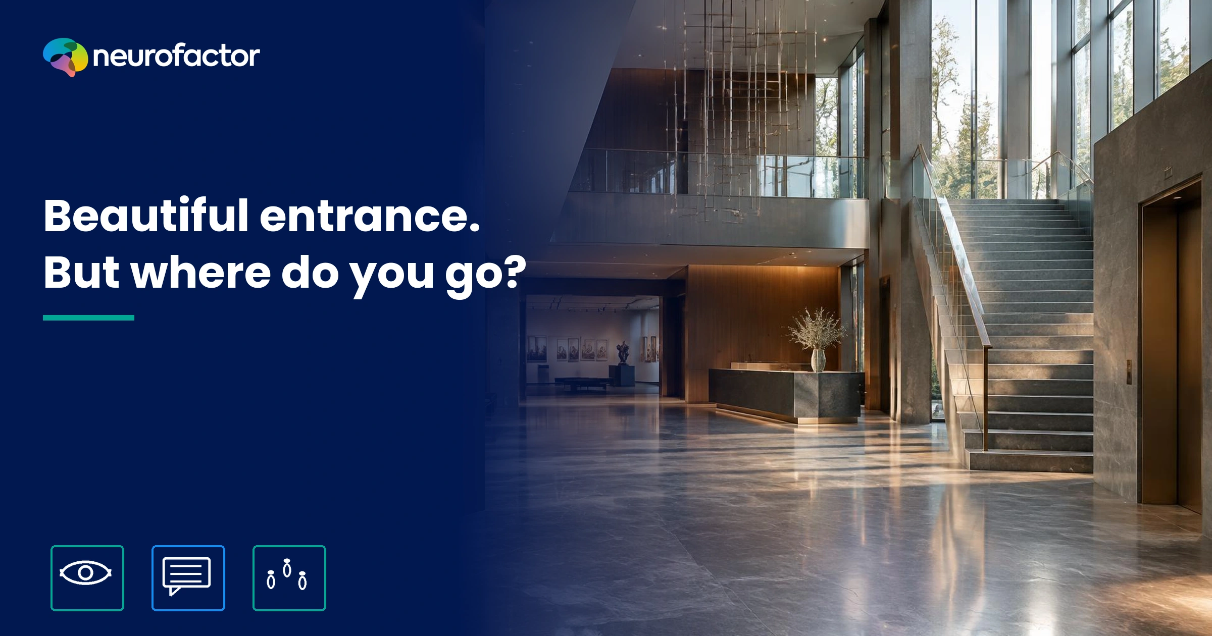
What does the entrance to a space make people associate with it immediately?
You enter a building. The materials are beautiful, the lighting looks deliberate and the architect is pleased with the result. Yet you stop for a moment. Is this the public entrance? Where should you check in? Are you allowed to continue? An entrance is not merely seen. It is interpreted. Visitors connect visible cues to possible meanings such as welcome, reassurance, exclusivity, professionalism or distance. Those associations can make the next step easier or create hesitation. This is why evaluating an entrance requires more than asking whether it looks attractive. You need to understand the meaning it conveys, whether people can read the space and what they actually do.
The first question is not whether the entrance looks good, but what it means
For a designer, the entrance may appear to be a finished visual composition. For the visitor, it is a sequence of decisions. Where does the public route begin? Is that door for staff? Should I wait or proceed? Do I need a booking? Will I feel comfortable in this space?
People do not have to formulate each question consciously. They can form an initial impression while searching for guidance about the next action. Glass walls may suggest openness, yet an invisible door can make access harder to understand. A grand reception desk may communicate competence while also feeling intimidating to someone unfamiliar with the organisation. A minimalist entrance can look professional, but the same lack of visual clutter may feel empty if no one knows where to go.
So the productive research question is not, 'Which colour makes everyone feel welcome?' It is: which observable cues are linked to the meanings our visitors need, and do those meanings support the right action? That makes experience design a testable discipline instead of a debate about taste.
Bitner's servicescape framework explains why the physical setting matters to customers and employees who take part in a service [1]. It provides a useful foundation for studying entrances as part of the experience rather than as decoration next to it. It does not establish that a particular material or layout automatically creates the same reaction in every person.
The association layer is especially interesting. The word 'exclusive' might attract a visitor seeking a premium service and make a first-time visitor wonder whether they belong. One architectural cue can support attraction and resistance at the same time. Understanding that contrast is more valuable than choosing a generic emotion and working backwards to a fashionable colour palette.
Six entrance cues that can shape meaning
People encounter combinations of cues rather than one isolated surface. Research by Baker and colleagues examines the joint role of social, design and ambient signals in retail environments [5]. The following table translates that perspective into a practical diagnostic framework. It is not a universal dictionary in which a stimulus always produces a fixed emotion.
Feeling safe is not the same as being objectively safe. Nor does an attractive photograph demonstrate wheelchair accessibility, usable contrast or appropriate wayfinding for someone with limited vision. Safety and access also require physical assessment, appropriate expertise and relevant standards.
Context determines the dominant goal. A museum visitor may be looking for discovery. Someone arriving at a medical facility may primarily need certainty about the route. A candidate attending an interview might infer something about hierarchy from the reception area. These are plausible research hypotheses, not labels to attach to everyone in those groups.
This distinction matters commercially as well. Changing a doorway to appear more premium might help one brand objective while creating a barrier to another. The issue is not whether the entrance is visually impressive in isolation, but whether the meaning aligns with what the organisation promises and what the visitor needs to do.
Visible doorway and sightlines
- Possible positive association
- Open, transparent, accessible
- Possible source of resistance
- Unclear access, lack of privacy
- How to test it
- Ask newcomers to find the correct public entrance
Reception desk and staff presence
- Possible positive association
- Personal, reassuring, professional
- Possible source of resistance
- Formal control, queuing, fear of interrupting
- How to test it
- Observe where people stop and when they seek help
Materials, maintenance and detail
- Possible positive association
- Quality, care, craftsmanship
- Possible source of resistance
- Coldness, expense, excessive formality
- How to test it
- Gather spontaneous meanings and context-specific judgments
Lighting, acoustics and crowding
- Possible positive association
- Warmth, energy, liveliness
- Possible source of resistance
- Overstimulation, uncertainty, discomfort
- How to test it
- Combine experience reports with observations in context
Signage and information hierarchy
- Possible positive association
- Clarity, independence, confidence
- Possible source of resistance
- Information overload and conflicting directions
- How to test it
- Give visitors a real navigation task without assistance
Doors, thresholds and physical access
- Possible positive association
- Inclusion, effortless arrival
- Possible source of resistance
- Physical barriers and perceived exclusion
- How to test it
- Conduct access audits and testing with relevant users
Beautiful, legible and welcoming are different judgments
A common design error starts with a render. Two concepts are shown, respondents choose the most attractive one, and the preferred image is declared the better visitor experience. That conclusion reaches beyond the evidence.
In his review of how people evaluate building exteriors, Nasar identifies formal characteristics, symbolic meanings and expectations as relevant to architectural preferences [3]. Those factors matter, but a favourable evaluation of the facade is not equivalent to completing a task without confusion.
Vartanian and colleagues tested judgments of photographs of interior spaces that differed in curved or straight contours [4]. Participants were more likely to rate curvilinear interiors as beautiful. Yet the contour difference did not significantly change their separate decisions to enter or leave the depicted spaces. This is not evidence that appearance never affects behaviour. It shows that liking a visual feature and deciding to approach a space cannot be treated as the same dependent variable. The study also relied on photographs and a controlled task, not real visitors navigating a working entrance.
Weisman's investigation of architectural legibility linked spatial configuration to difficulties finding routes in university buildings [2]. Its relevance to entrance design is that spatial comprehensibility deserves its own measurement. It does not mean that one type of sign or floor plan is guaranteed to work everywhere.
A successful entrance has to answer several questions: does the visitor want to be here, understand what comes next, have the practical ability to proceed and find that their expectation is met? Combining all four into one satisfaction rating conceals why a design succeeds or fails.
Expectations and familiarity shape the first impression
A visitor's initial interpretation may begin long before they reach the building. Someone who has seen a lively and informal venue online will arrive with different expectations from someone invited through a formal appointment letter. The very same reception area can therefore feel appropriate to one person and unexpectedly distant to another. Familiarity matters too. A returning guest may interpret a subtle cue that a newcomer will not recognise.
This does not mean that every difficulty is caused by expectation. A poorly visible entrance may confuse experienced and inexperienced guests alike. Conversely, a first-time visitor may seek reassurance even when the route is objectively simple. Prior knowledge and physical design should not be treated as interchangeable explanations. Ask what visitors expect, whether they know the building and what they actually do on arrival.
Staff involvement also matters. A friendly employee can compensate for confusing wayfinding, but that does not make the layout itself legible. When people reach their destination only because someone intervenes, record that assistance as part of the service environment. Then test the entrance again under ordinary staffing conditions, when extra guidance cannot be guaranteed.
From the first glance to the next action: three separate measurement layers
An entrance cannot be tested adequately with only 'How did you like it?' First define the intended result. A clearer route might help people arrive more quickly without improving beauty ratings. A visually inviting room can be enjoyed even while visitors continue waiting at the wrong door.
Interpret each measure in context. A visitor may stare at a sign because it helps, or because it is confusing. Long gaze duration can reflect interest or effort. Fast navigation may reflect familiarity instead of a well-designed environment. If those distinctions are ignored, measurements turn into confident stories unsupported by the data.
It is also useful to distinguish expectation from experience. Before the visit, ask what kind of reception someone anticipates. At the entrance, record the meanings evoked. After the task, ask whether the experience confirmed or challenged the expectation. This creates a meaningful sequence instead of a disconnected snapshot.
Visual attention
- Core question
- What was noticed or overlooked?
- Suitable example method
- Observation, eye tracking, first fixation and scan pattern
- What it does not demonstrate
- Looking does not establish understanding or approval
Associated meaning
- Core question
- What meanings does this entrance evoke?
- Suitable example method
- Open associations, semantic ratings, validated association tasks
- What it does not demonstrate
- An association alone does not prove causation
Wayfinding behaviour
- Core question
- Which action follows?
- Suitable example method
- Task completion, detours, requests for help, route time
- What it does not demonstrate
- A fast route does not guarantee a positive experience
Fictional example: a cultural centre that looks open but creates uncertainty
Imagine a new cultural centre with a glass facade and an impressive atrium. The main staircase forms the visual centre of the entrance. Posters for exhibitions cover one wall. Architecture photographs make the venue appear accessible and inspiring. Its public promise is that everyone is welcome.
On a typical Saturday three people arrive. Mara is visiting an exhibition for the first time and is unsure whether she may walk straight in. Sam brings a child to a workshop and needs a clear accessible route beyond the staircase. Yassin has a meeting with the programme director but cannot see where professional guests should report. All three visitors and their experiences are fictional. This is not a Neurofactor field study or a report of measured customer outcomes.
Mara might associate the grand hall with discovery and intimidation at once. Sam may attend primarily to the lift and the entrance's traffic flow. Yassin is seeking human confirmation rather than the exhibition. Asking all three whether the atrium is beautiful would conceal their distinct needs.
Now consider two proposed alterations. Version A leaves the visual concept largely intact, but establishes a clearly identifiable reception point and a simple route map. Version B adds warmer furnishings while leaving guidance unchanged. If the research objective is wayfinding, version A is the more direct test. If the objective is perceived hospitality, version B may be relevant. These are hypotheses, not predicted results.
The experiment is useful because it separates the mechanism a design aims to change from the outcome that would count as evidence. A beautiful rendering, a positive association and a successful visit are related possibilities, not interchangeable findings.
Find out what different visitors associate with the same space
Association research should begin with the behavioural decision, not the equipment. Recruit people with different reasons for attending: ticket holders, event participants, suppliers, staff, frequent visitors and newcomers. Include those for whom access and orientation make an important difference. Do not use one participant as if they represent everyone like them.
Ask people to describe an entrance image or, better, their real arrival in their own words. What three words come to mind? What do you expect from the organisation? Where would you go first? What makes you think you are welcome, or not? Allow conflicting meanings and uncertainty rather than only positive choices such as 'modern' and 'beautiful'.
A carefully designed reaction-time or implicit association task may be appropriate if the research question concerns the relative strength of links between entrance concepts and meanings such as open, formal, relaxed or intimidating. It does not read minds and cannot independently establish a specific emotion or a person's future behaviour. Stimulus design, validation, recruitment and cautious interpretation matter. Neurofactor outlines the broader research approach on its research methods page.
Observation provides different evidence. Where does someone pause? Which door do they try? Can they locate the lift without assistance? Do they have to retrace their steps? Record prior familiarity, visitor goals and the environment's operating conditions. Without that context, it is easy to mistake a difference in experience for an effect of design.
Eye tracking can identify what information people visually attend to or miss. It cannot, by itself, establish what they believe a sign means. Mobile EEG or another physiological tool may add value for a specifically justified real-world question, but no signal can simply be translated into 'this visitor feels safe'. Research design and behavioural context remain essential. For basic wayfinding, direct observation is often the more efficient starting point.
A seven-step field protocol for testing a first encounter
Research becomes actionable when you know which decision to make and what evidence would justify it. A practical entrance study can follow seven steps.
1. Specify the task. Are visitors supposed to find the public door, check in, collect a ticket, locate a lift or reach a particular room? Choose a primary task rather than vaguely aiming to create a 'better entrance'.
2. Write down the association hypothesis. For instance, an enclosed reception area may evoke distance rather than welcome among newcomers, prompting additional requests for confirmation. That is a proposition to test, not a finding.
3. Define users and conditions. Include first-time and repeat visits, differing goals, quiet and busy periods, routes and relevant accessibility requirements. Predefine which comparisons are justified.
4. Record a baseline. Measure task success, wrong turns, requests for help and time to destination. Add concise associations and ratings of clarity, welcome and suitability. Avoid collecting personal information that is not needed.
5. Change a targeted mechanism. Test one meaningful variable where possible, such as reception visibility, sign hierarchy or the location of a public entrance. If random assignment cannot be achieved, say clearly that before-and-after differences may reflect other changes.
6. Compare outcomes in context. Examine both averages and meaningful subgroups. Who benefited? Did visitors without prior knowledge improve? Were staffing levels, noise, crowding and opening hours comparable? Consider a reference area or period where feasible.
7. Make a design decision from the evidence. Clearer directions may improve navigation without changing brand associations. A warmer atmosphere may improve perceived welcome without making the lift easier to find. Choose on the basis of declared primary and secondary outcomes.
Then revisit the result during ordinary operation. A trial staffed by additional employees can look successful while ordinary weekdays reveal the same difficulties. A festive opening does not represent every arrival scenario.
Seven design choices worth testing rather than assuming
Make the first action visible. People should be able to identify the correct entrance and what to do after crossing the threshold. Test with newcomers rather than with the project team, which already knows the layout.
Demonstrate hospitality in behaviour. A phrase such as 'everyone is welcome' gains credibility when the staff, service process and access arrangements match it.
Reduce competition between messages. A clear primary route can be more useful than several equally prominent signs. Verify this with realistic navigation tasks instead of an aesthetic preference poll.
Examine the meanings of materials and lighting. A darker, premium entrance may be appropriate for one brand and alienating for another audience. Do not assume that any colour has a universal psychological meaning.
Differentiate visitor journeys. Families, people arriving for appointments, suppliers and staff may need different destinations. Make the branching understandable without overwhelming everybody at the door.
Test real operating conditions. Weather, doors left open, queues, background noise, cleaning schedules and crowded sightlines can all change what is perceived. A silent three-dimensional render cannot reproduce that.
Build accessibility into the original concept. A welcoming main entrance should not quietly require some visitors to locate a separate, poorly marked alternative. Assess physical accessibility with the right users and professional criteria, not association ratings alone.
These are testable design interventions, not a ranking of guaranteed conversion tactics. The correct priority comes from what the real user problem turns out to be.
The same entrance, two visitors, two very different questions
A cultural venue uses one sentence across its communications: 'Come in and discover.' A frequent visitor may read that as an exciting invitation. The tall, open atrium promises exploration. A first-time guest unfamiliar with cultural institutions may instead ask, 'How does this place work?'
If the latter audience is mainly uncertain about procedure, making the slogan larger is unlikely to address the core issue. A visible and welcoming starting point could be more relevant. If repeat visitors mostly lack a sense of novelty, a different intervention may be needed. You only know which change fits after investigating how the message is interpreted.
That is why an effective entrance is not a single script for everyone. It supports the next action of someone seeking certainty while leaving room for curiosity in those who came to explore. Designing for the real visitor means understanding both the shared setting and the different meanings it may generate.
What association research can and cannot establish
Not everyone associates glass with openness or stone with premium quality. Meaning depends on culture, past experience, expectations, purpose, physical access and the configuration of all the cues together. A single association score should not be treated as an infallible individual diagnosis.
The distinction between visual preference and behaviour is particularly important. In Vartanian and colleagues' controlled architectural experiment, contour influenced beauty judgments but not the specific approach-avoidance decision [4]. That does not mean physical design never affects actions. It means that effects must be demonstrated for each outcome rather than carried over by assumption.
Likewise, if more visitors independently find the correct room after a signage change, the evidence concerns navigation under those conditions. It does not automatically establish increased feelings of safety, higher revenue or a neural explanation. Each further claim requires separate support.
Employees belong in the evaluation too. A new reception arrangement may help visitors while interrupting staff tasks or creating unacceptable queues. Bitner's framework explicitly includes the people delivering the service [1]. An entrance that works visually for the customer but poorly for the employee is not an optimised servicescape.
Conclusion: meaning starts the experience, use shows whether it works
An entrance succeeds through more than an attractive photograph or an approved mood board. Visitors need to understand it, interpret its invitation in a way that fits their purpose and complete their first action without unnecessary friction.
The key design question is not simply what the entrance should express, but what people take it to mean and how that meaning connects to their next step. Association research makes the meanings visible. Observation and controlled field tests help establish whether the design actually supports visitors.
Related articles and methods
- Explore Neurofactor's research methods for association research, eye tracking and measurement in real settings.
- See the applications of behavioural research in experience, design and physical environments.
- How does an experience begin before anyone walks through the door?
Key terms
- Entrance association
- A meaning a visitor connects to visible, social or sensory cues at the threshold of a space.
- Servicescape
- The physical and sensory environment in which a service takes place and both visitors and staff act.
- Wayfinding
- The process of identifying and following a route to a destination within or around a building.
- Architectural legibility
- How effectively the spatial configuration and cues of a building help people understand where they are and where to go.
- Associative resistance
- A potentially discouraging meaning attached to a situation or option, without implying a proven causal effect.
- Real-world validation
- Testing a design in its actual context of use with preselected behavioural and experience outcomes.
Frequently asked questions
What associations can a building entrance trigger?
Possible meanings include welcome, professionalism, calmness, confidence, status, distance and uncertainty. Which meaning is activated depends on the entrance, the visitor and the reason for visiting. It should be measured rather than inferred from one colour or shape.
Can an entrance look beautiful but still be confusing?
Yes. Aesthetic appreciation and navigation are separate outcomes. Visitors may admire a space while missing the right door or check-in point. Measure beauty, route comprehension and task performance separately.
How do you test whether an entrance feels welcoming?
Combine open association questions and context-specific ratings with observations such as hesitation, requests for help and route choices. Check whether employee behaviour and actual access arrangements reinforce the intended welcome.
Do you need eye tracking or EEG to test an entrance?
Not automatically. Observation and a navigation task often provide the most useful baseline. Eye tracking can add visual-attention data. EEG needs a specifically justified research question and cannot independently prove that someone feels welcome.
How is a confusing entrance different from a negative association?
Confusion concerns difficulty understanding or navigating the space. A negative association concerns a meaning such as intimidation or social distance. The two can coincide, but they require different evidence and possibly different interventions.
How can you establish whether a redesigned entrance works better?
Define a primary task, establish baseline performance and test a targeted change. Compare task outcomes, requests for help and intended associations under comparable conditions while documenting visitor differences and possible confounding factors.
Sources
- 1.Servicescapes: The Impact of Physical Surroundings on Customers and Employees - Journal of Marketing (1992)
- 2.Evaluating Architectural Legibility: Way-Finding in the Built Environment - Environment and Behavior (1981)
- 3.Urban Design Aesthetics: The Evaluative Qualities of Building Exteriors - Environment and Behavior (1994)
- 4.Impact of contour on aesthetic judgments and approach-avoidance decisions in architecture - Proceedings of the National Academy of Sciences (2013)
- 5.The Influence of Multiple Store Environment Cues on Perceived Merchandise Value and Patronage Intentions - Journal of Marketing (2002)
- 6.Atmospheric Effects on Shopping Behavior: A Review of the Experimental Evidence - Journal of Business Research (2000)
Read next
Reviewed by: Martijn den Otter · Last reviewed: 10/30/2026