
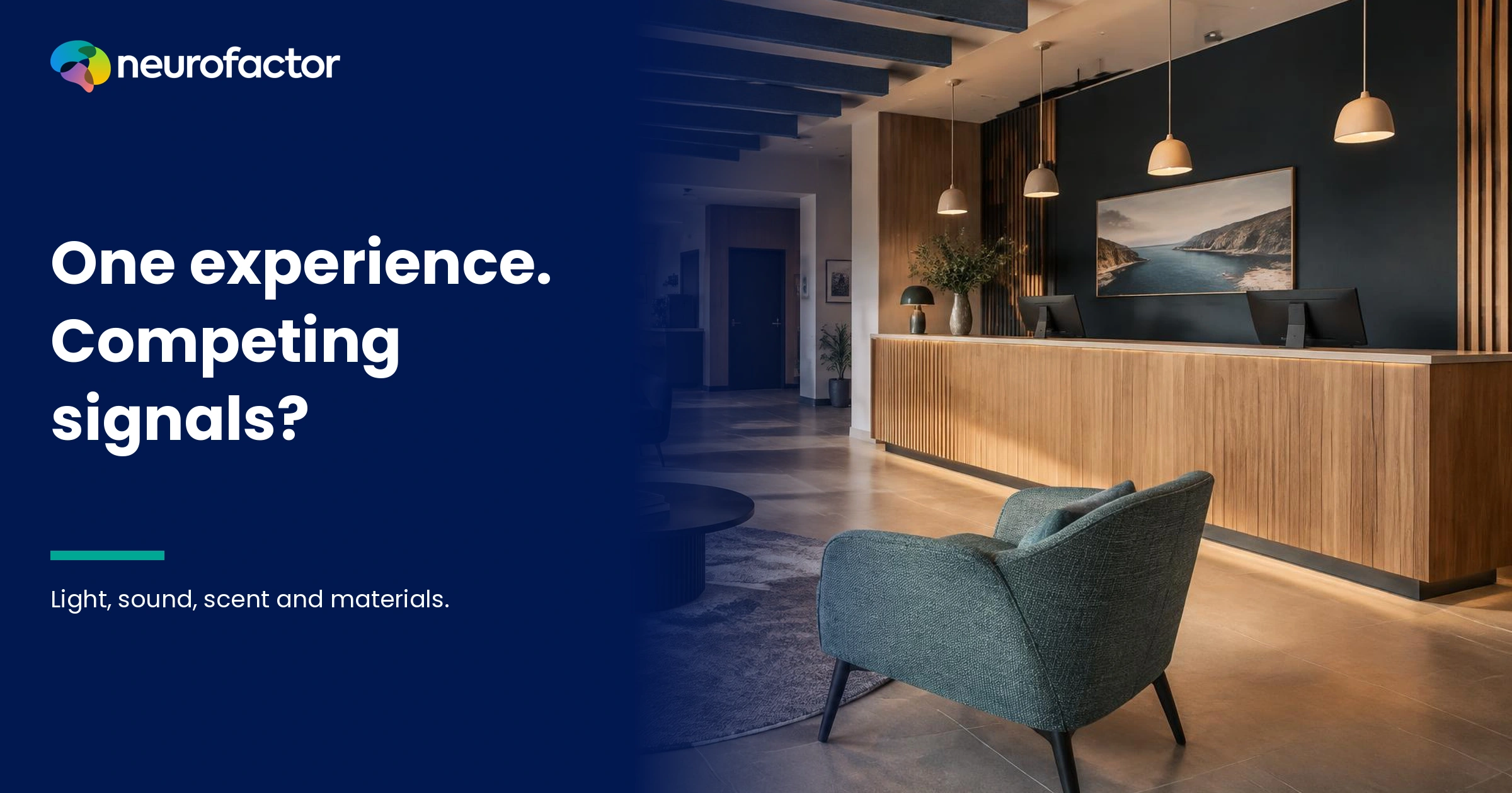
When every sense in a space tells the same story, what actually changes?
Walk into a small hotel. The wood at the reception desk feels warm. The light is gentle, the music restrained, and somewhere nearby there is the smell of freshly made coffee. The combination seems to make sense. Now change one element: play loud, fast electronic music while leaving everything else untouched. The room has not become smaller. The chair has not changed, and neither has the coffee. Yet the meaning of the experience might shift. It might feel rushed rather than welcoming. Or visitors might not care at all. You cannot know the answer from an interior rendering. That is what multisensory experience research is really about: when do light, sound, scent, touch and material reinforce one another through association, and when do they create conflicting expectations? The answer is not a matter of adding more stimuli. It is a matter of what people infer from the combination, what they are trying to do, what the brand promises and what the place genuinely delivers.
AI summary: Sensory signals can reinforce one another associatively when their meaning, intensity, timing and apparent origin fit a particular experience. Calm lighting, a workable sound environment and inviting materials may jointly support a welcoming reception. Congruence, however, is not proof of objective quality, customer loyalty or higher spending. Investigate the individual cues, their combinations, the expectations people bring, their interpretations and their behaviour. Use observation and association research and, when justified, eye tracking or EEG with clear limits. Test improvements against meaningful alternatives, and protect accessibility, employee wellbeing and truthful communication. Sometimes a purposeful contrast or the removal of a stimulus is the better design.
An experience is not five separate design budgets added together
In many organisations, the sensory experience is divided into departments. The interior designer decides on materials. Marketing selects a scent. Another team licenses music. Lighting is configured by a technical contractor, while employees learn how to receive guests. Every choice may appear sensible in isolation. Their combination can still be inconsistent.
Imagine a brand promising 'calm, personal attention'. Warm materials, a comfortable waiting area and non-glare lighting could support that promise. But repeated alert tones, invasive fragrance or a bright promotional screen might send a competing message. That is a plausible hypothesis, not a universal effect. Whether the experience feels coherent depends on the task, visitors, exposure time, intensity and what people already expect.
Krishna defines sensory marketing in terms of engaging the senses in ways that affect perception, judgment and behaviour. [1] Spence and colleagues review visual, auditory, haptic, olfactory and taste-related aspects of retail atmospherics together. [4] These works provide reasons to study interactions across the senses. Neither provides an all-purpose recipe for a perfect shop, museum or hotel.
Perceptual science distinguishes multisensory integration from crossmodal correspondence. Integration concerns how information from different sensory systems contributes to the perception of a common event. A correspondence is a tendency to associate attributes across senses, such as particular sound properties with shapes. Spence surveys these relationships in a tutorial review. [2] But a shared descriptive word such as 'soft' does not automatically prove that two stimuli have been integrated into a single neural event. Some associations reflect language, learning and context.
For businesses, the distinction matters. A visitor may associate a room with high quality while finding it impossible to hear the receptionist. A scent might appear consistent with the brand but be too strong for another visitor. A luxury-looking material might fail the touch test. Sensory coherence is useful when it supports a truthful, usable experience, not merely an attractive impression.
Instead of starting with 'Which fragrance matches our colour palette?', ask what the visitor needs to understand or do. Is the main task to navigate, rest, learn, assess product quality, communicate or choose? What outcome can the organisation credibly promise? Only then should sensory details be selected to support that task. The alternative is to treat sensory effects as decoration without responsibility for their consequences.
Another mistake is assuming that every added matching cue makes the overall experience stronger. Four signals conveying relaxation do not necessarily produce four times as much relaxation. Repetition may add little, saturation can occur, and excessive stimulation can become tiring. An excellent design may include fewer sounds, no artificial scent and clearer functional light. The subtraction is part of the strategy, not evidence that the strategy failed.
Eight associative connections that can reinforce or undermine an experience
The following matrix is a way of designing research questions. It is not a catalogue of guaranteed responses. Meaning must be investigated with real visitors in context.
| Associative dimension | Potentially supportive cues | Possible contradiction | What to investigate |
|---|---|---|---|
| Calm and slowing down | Low-noise surroundings, comfortable materials, non-glare light | Repeated alarms or intrusive bass | Does the setting support calm without hiding useful information? |
| Energy and movement | Clear wayfinding, rhythmic sound, active circulation | Excessive stimulation in a waiting area | Does the energy assist the task or increase strain? |
| Premium and craftsmanship | Careful finishes, appropriate acoustics, consistent details | Cheap-feeling components behind luxury claims | Which cues actually support a quality expectation? |
| Naturalness and authenticity | Honest materials and provenance, appropriate visual language | Artificial fragrance implying unsupported natural origins | Is the meaning grounded in verifiable facts? |
| Trust and safety | Predictable lighting, audible explanations, understandable layout | Invisible exits and confusing processes | Can people understand what happens next? |
| Warmth and hospitality | Accessible welcome, comfortable contact and sound | Strong fragrance or intrusive intimacy | Is the welcome pleasant without crossing boundaries? |
| Professionalism and precision | Task lighting, clear feedback, controlled sound | Music and glare that interfere with careful work | Can visitors and staff carry out the essential activity? |
| Brand recognition | Consistent tone, form and genuine service | Beautiful design coupled with impersonal treatment | Does the complete experience express the real promise? |
These dimensions are not eight psychological buyer types. The same person might need quiet while waiting and energy during an interactive demonstration. A business traveller might value precise professional service and personal warmth. Associations always have a referent and a context. Their meaning cannot simply be read from a demographic label.
Importantly, sensory appropriateness is not equivalent to every signal being alike. Emergency exits should stand out. A warning tone may need to break through background music. High-contrast wayfinding may be essential in an otherwise muted space. Functionally necessary differences can make an environment more coherent at the level of purpose, even though they are visually or acoustically distinct.
Aesthetic coherence is also not the same as a distinctive brand. Many hotels use wood, warm lighting and soft music. Visitors can enjoy these cues and forget the hotel name an hour later. Brand meaning needs an authentic, recognisable pattern in the things that matter: reception, spatial orientation, service, product experience and communication. The fact that an environment feels 'premium' does not establish who it belongs to.
Spence discusses how sounds and shapes can create product-related sensory expectations. [5] Velasco and colleagues review correspondences between shape and taste. [9] These findings show that combinations can carry meaning before consumption. They do not establish that a particular form makes every kind of business more trustworthy. Moving from a food experiment to a bank branch requires a fresh question and a fresh test.
When congruence helps and when contrast is the right decision
One influential field study by Mattila and Wirtz manipulated pleasant ambient music and scents with different arousal qualities. In that setting, matching arousal levels were associated with more favourable evaluations and differences in approach-related behaviour than mismatched combinations. [3] This is evidence that interactions matter under studied conditions. It is not proof that any two pleasant stimuli create more sales, or that low arousal is always desirable.
Several types of congruence should be separated. Semantic congruence concerns meanings that seem to fit. Arousal congruence concerns compatible levels of activation. Temporal congruence is about cues arriving together at a meaningful moment. Common-origin congruence is about signals seeming to belong to one object or action. Brand congruence concerns whether the whole experience reflects the organisation's actual character and promise.
| Relationship | Testable hypothesis | Example | Interpretation risk |
|---|---|---|---|
| Semantic | Cues evoke related meanings | Soft textiles and an inviting reception | Assuming that 'soft' necessarily proves trust |
| Arousal | Sound, light and task demands feel proportionate | Restrained music during a relaxed consultation | Assuming that quieter is always better for everyone |
| Timing | A signal makes sense when an event occurs | Subtle confirmation after completing an action | The cue draws attention away from the task |
| Common origin | Cues appear to come from the same event | Sound and touch of a drawer closing | Treating added audio as evidence of actual build quality |
| Brand promise | The senses and service support the same expectation | Personal service in a brand built on care | Using atmosphere to conceal poor service |
The unity assumption explored by Chen and Spence concerns whether a perceiver considers signals to belong to the same event or source. The evidence suggests it can affect multisensory perception under certain experimental conditions. [6] That is a mechanism at the perceptual level. It cannot be directly converted into a claim that shoppers become loyal whenever two brand cues seem to match.
There is also a productive role for deliberate contrast. A museum visitor may focus more easily after passing from a lively entrance into a quieter gallery. A coffee machine may contribute a brief, characteristic sound against a gentle background. A showroom could use crisp task lighting in a demonstration area while the lounge remains warm. Difference helps when its purpose is legible to visitors.
An accidental mismatch is different. A brand promises exclusive attention yet its reception is dominated by mechanical queue announcements. A restaurant claims intimacy but visitors must shout to talk. A furniture showroom promises craftsmanship but presents materials under misleading illumination. These contradictions may emerge even when every component looked attractive on its own design board.
Do not confuse congruence with basic quality. A poorly ventilated room does not become healthy because its fragrance matches the music. An uncomfortable chair does not improve through warm lighting. Poor acoustics require an acoustic solution. Testing the whole atmosphere should not prevent you from detecting specific material and operational failures.
The visitor journey: five moments when meaning can change
Moment 1 - Expectations before arrival. A website, online photograph, recommendation or previous visit sets the frame. The physical setting must be understood in relation to that prior story. If a hotel is advertised as quiet and spacious but the lobby is loud and congested, the expectation gap can matter more than any one attractive material. Ask what people expect before exposing them to the environment, not after giving them the intended brand adjectives.
Moment 2 - First orientation. The first few metres answer practical questions. Where do I go? Am I welcome to sit? Who can help? How long will this take? Sound, lighting, circulation and visual cues influence this process. A sophisticated signature scent cannot replace useful signage. A monumental entrance may communicate prestige while making access feel more intimidating.
Moment 3 - Direct interaction. People touch a product, hear an explanation, choose a seat or order food. At this point, the relevant sense must support the activity. Touch may matter for furniture and materials; clear speech matters when service is complex. Peck and Childers examine how haptic information contributes to product evaluation depending on the item and the buyer's need for touch. [8] Do not make visitors infer quality from styling when they could responsibly evaluate the actual material.
Moment 4 - Decision and action. A visitor buys something, signs up, asks a question or decides to leave. A pleasant atmosphere can coexist with doubt about price, suitability or accessibility. Measure whether information was available and the choice was appropriate. A longer stay or a positive atmosphere rating is not automatically a better outcome for every service.
Moment 5 - Memory after departure. People may later describe a place as inviting, chaotic, credible or exhausting. The source of that description could be a striking moment, the service, the sound environment or the mismatch between expectation and reality. A repeated scent or sonic motif does not guarantee correct brand recall. Use fair, unprompted recall and recognition tasks to check whether the desired associations remain.
Follow those five moments as a sequence. Someone can admire the entrance and struggle to understand the check-in. Someone can find the visual style severe yet leave feeling supported because a member of staff explained everything clearly. A single overall score hides these changes. Multisensory design belongs in a journey, not merely in a static image or mood board.
Fictional case: a boutique hotel whose sensory messages do not quite agree
The entire following example is fictional. Hotel Binnenhaven, its visitors, proposed variants and reactions are illustrative. They do not represent actual Neurofactor client research, findings, business effects or fabricated testimonials.
Imagine Hotel Binnenhaven, a small fictional hotel with a reception, lobby and coffee corner. Its promise is personal attention without unnecessary formality. The lobby has dark wood, a stone reception counter and warm lighting. During the day, energetic electronic music is played, while a scent diffuser releases a strong spicy fragrance. Each component is intended to signal quality. But a visitor might perceive an identity conflict: is this a relaxed place to arrive, a trendy bar or an exclusive club? That is a plausible hypothesis, not an observed result.
The manager initially asks for a 'stronger multisensory identity'. One proposal adds more fragrance, stronger music and brighter accent lighting. Another removes almost everything to create one calm aesthetic. Neither can be called correct without understanding the visitors and the tasks. Maybe the music volume is the problem. Maybe the fragrance causes discomfort. Maybe the website overpromises silence. Or maybe the existing setting is effective for most visitors while a smaller group needs an alternative.
Start with the actual use of the space. Guests need to understand directions, hear check-in instructions, wait comfortably and decide whether to stay in the coffee corner. Reception staff must work without constantly raising their voices. Assess physical acoustics, ventilation, illumination and wayfinding separately from brand meaning. A real acoustic problem does not become an association problem just because it occurs inside a branded interior.
The team draws up three hypothetical design concepts. A - Current mix keeps the existing lighting, music and scent. B - Consistent reception retains the honest materials, reduces auditory load at check-in, uses fragrance only where appropriate and improves functional lighting. C - Purposeful contrast creates a relatively quiet reception area and a distinct, more animated coffee zone with an understandable transition. None is an identified winner. Operational feasibility and accessibility need review before any public test.
Participants receive realistic tasks: check in, ask for directions, find a waiting place and consider whether they would voluntarily have coffee afterwards. They may reject an aroma or request a quieter area. Before entry, assess what the brand and website suggested. During the visit, observe the actions and the cues they notice. Afterwards, collect spontaneous descriptions of the hotel, the evidence for those descriptions and the difference between appearance and actual function.
A subsequent field comparison might present the variants across comparable periods while accounting for staffing, occupancy, visitors' reasons for travel, weather and promotions. It would be misleading to change lighting, staffing and fragrance together, then attribute a result to fragrance alone. Choose a meaningful primary measure, such as correctly completed and understandable check-ins, and supporting outcomes including hospitality associations, complaints, waiting, staff workload and appropriate use of the coffee corner.
The result might favour C. A simple reduction in music volume might be sufficient. Or research might reveal that slow reception processes, rather than sensory conflict, explain dissatisfaction. All are valid findings. The goal is not to build the most theatrical sensory environment. It is to make the organisation's promise understandable while supporting the real task.
The same principle applies to a museum, office, retailer or product showroom. In a museum, concentration and respectful silence may be central. In a showroom, genuine material contact may be essential. The same wood, warm lighting and soft soundtrack cannot be assumed to mean the same thing in every setting.
A nine-step research protocol
Step 1 - Define the actual purpose. Avoid using 'the room should feel premium' as your sole outcome. Determine which activity the environment must support. Is it a waiting space, a restaurant, a shop, a museum or a learning environment? Separate orientation, perceived comfort, comprehension, recognition, choice and later satisfaction. Specify a primary measure and guardrails, including accessibility, safety and workload, before changing anything.
Step 2 - Document the physical conditions. Where relevant, measure sound levels and reverberation, glare and light intensity, ventilation, scent sources, material properties and location within the space. Test whether the environment works without a special marketing layer. Excessive noise calls for an acoustic response, not a different fragrance. Conditions can vary by hour, season and occupancy.
Step 3 - Identify the expectations people bring. Use open questions about the website, invitations, previous visits and reason for attending. Invite participants to use their own language before offering labels such as 'luxury', 'warmth' or 'calm'. Ask what a disappointing experience would look like. Resist converting a handful of answers into universal customer personalities.
Step 4 - Investigate individual and combined associations. What does a sound mean alone? What expectations are associated with the material or light? What changes when the cues appear together? Explicit association tasks may be appropriate. Carefully designed implicit measures can add information when reliability, validity and scoring are adequate. Keep product, environment, brand and service associations distinct.
Step 5 - Create a meaningful comparison. Compare the existing experience with an acoustic adjustment, then potentially a condition combining acoustic and lighting changes. A factorial design can help disentangle individual and interaction effects, provided the study has enough observations and practical control. Do not invent statistical certainty from a complex design with a tiny sample.
Step 6 - Observe real activities. Ask people to navigate, read instructions, touch relevant materials, follow a conversation or wait for a service. A space may earn positive aesthetic ratings while the task fails. Record misunderstandings, physical discomfort and missed information. If using eye tracking, specify what the person was trying to achieve before interpreting visual attention.
Step 7 - Test meaning as well as consistency. Ask whether cues seem related and what their combination communicates. Does that match the real organisation? Allow unwanted associations and negative feedback. Compare relevant contexts without forcing age or occupation stereotypes onto participants. Small apparent subgroup differences should be treated as preliminary.
Step 8 - Evaluate behaviour with an appropriate design. Define the primary KPI before looking at results. A controlled field test may use comparable locations, periods or randomised time blocks, with suitable allowance for staff, visitor mix and occupancy. Report denominators, uncertainty and the conditions studied. A pleasant evaluation is not itself evidence of a behavioural change.
Step 9 - Review safety, sustainability and ownership. Employees may be exposed to the same soundtrack or fragrance for an entire shift. Check accessibility, exposure, ventilation, opt-out opportunities, maintenance costs and applicable requirements. Test whether the setting remains workable during normal operations and assign responsibility across marketing, facilities, design and operations.
This is not a compulsory sequence that always requires EEG or an implicit association instrument. Choose methods according to the decision. In one setting, measuring speech intelligibility and observing check-in might be sufficient. In another, conflicting brand associations might justify a broader study. A method has value when it can distinguish plausible explanations and change an actual decision.
Turning an associative diagnosis into a testable design decision
An observation is useful only when it creates a decision path. 'The room feels busy' is too general to guide an intervention. Does this result from sound, movement, wayfinding, visitor expectations or the image the materials suggest? Each explanation implies a different action and a different test. A good hypothesis must be capable of being disproved.
| Observation | Associative hypothesis | Alternative explanation | First suitable test |
|---|---|---|---|
| The lobby is called 'restless' | Music and lighting suggest haste | Queues and staffing are the real problem | Compare acoustic conditions with waiting time and check-in tasks |
| A warm-looking room feels 'cold' | Materials and service fail to convey hospitality | Low temperature or distant staff behaviour | Check climate and interview without prompted adjectives |
| Products look high quality but are rarely touched | Visual luxury implies that touching is forbidden | No access or uncertainty about price | Observe a task with explicit permission to handle materials |
| A gallery is described as tiring | Visual activity and sound interfere with attention | Long routes and too few seats | Assess sound, route, duration and rest opportunities separately |
| Guests recall the mood but not the brand | Generic congruence lacks a distinctive cue | Brand identification was simply invisible | Use fair, unprompted recall and recognition |
| Fragrance is described as 'authentic' | It fits an assumed product origin | The response follows a written label | Separate the description from the smell and verify provenance |
Write precise hypotheses. For example: 'Reducing background sound at reception while leaving other conditions stable will help guests understand explanations and may support an association with calm attention.' Specify what counts as support, the intended population and possible unintended effects. Alternatively, making product materials easier to touch may help visitors judge real texture instead of relying on a luxury-looking presentation.
Crucially, a consistent sensory combination can reinforce the wrong promise. A clinical environment designed entirely to feel like a luxury spa may please some visitors and leave others unsure about clinical clarity. Study the actual task, the visitor's prior expectations and the evidence offered. Never make a design decision on harmony alone.
Research can even show that the marketing proposition, not the interior, needs changing. If visitors consistently recognise practical expertise while the brand claims unstructured glamour, it may be wiser to improve the brand story. The environment should not always be forced into an outdated positioning statement.
Ten design decisions for a coherent multisensory environment
1. Start with the activity rather than an adjective. 'Premium', 'calm' and 'energetic' describe possible interpretations. They do not tell you whether people can find a destination or hear an explanation. Begin with the service task. Include at least one realistic scenario in which a visitor decides the offer is not suitable.
2. Map associations across moments. Identify the impressions expected before, during and after the experience. Note which signals support the intended meaning, which conflict with it and which remain unknown. This prevents the entrance design from receiving all attention while the critical interaction happens elsewhere.
3. Control intensity and cumulative load. A fragrance may be appealing for a few minutes and tiring during prolonged exposure. Background music might be welcome to guests and exhausting to staff. Treat silence, clean air, visual rest and adjustable task lighting as legitimate options. Provide a lower-stimulation route where feasible.
4. Protect accessibility over visual uniformity. Low contrast can look sophisticated yet make signage unreadable. Atmospheric lighting can make menus difficult to interpret. A decorative acoustic treatment is not a substitute for understandable speech. Check with actual users rather than assuming all visitors share the same sensory preferences.
5. Let materials communicate truthful properties. If a brand claims natural materials, confirm what is actually used and where it comes from. A synthetic finish can look like wood from a distance yet feel different. Haptic interaction can support evaluation when the material is relevant. Peck and Childers show how the value of touch varies across products and situations. [8]
6. Give sound a job. Distinguish atmosphere, information, safety and action feedback. A confirmation tone can clarify an interaction, while music can frame the setting. They need not have identical roles. Assess speech intelligibility and the experience of people who are sensitive to sound.
7. Treat scent as optional, not compulsory persuasion. Airflow, habituation, existing odours and individual sensitivity complicate fragrance design. Do not make exposure unavoidable or equate a pleasant aroma with a good product. Check the factual basis for claims about ingredients or origins, and offer ways to avoid a scent where possible.
8. Design transitions between zones. A quiet reception and a lively coffee corner can form one understandable journey. A transition to silence can focus attention in a museum. Think beyond the individual room and examine the point where people move from one activity to another.
9. Combine experience ratings with observable behaviour. Ask what the setting means, but check whether visitors can navigate, understand, assess products and make suitable choices. A higher premium score is not proof that people spend more or return. Measure outcomes after repeated exposure where feasible.
10. Build maintenance into the concept. Natural light changes. Fragrances mix with cleaning products and coffee. Materials wear, sound levels creep upward, and staffing changes. Assign owners for settings, complaints and periodic reassessment. A concept is only strong when it survives ordinary operational days.
These are decisions to investigate, not guaranteed levers for conversion. In some projects the best intervention is to remove several competing cues. In others, making two zones deliberately different may fit the journey better than creating one uniform sensory identity everywhere.
What the scientific literature actually supports
Krishna's review provides a framework for how sensory inputs can affect perception, judgments and behaviour. [1] The review by Spence and colleagues expands the question to the combined retail atmosphere, including practical research gaps. [4] Such work supports studying multisensory design as a legitimate subject. It does not demonstrate that a particular aroma, colour or music genre will work for all audiences.
Mattila and Wirtz offer a more specific example. Their retail field design combined different arousal levels of pleasant music and scent, finding advantages for matching conditions on certain evaluated and behavioural outcomes. [3] The transferable lesson is that an interaction between cues may matter. The transferable lesson is not to copy the exact stimuli or promise a fixed percentage increase for another shop.
Spence describes crossmodal correspondences in perception. [2] His review of sound and shape symbolism discusses how product-related expectations can be created. [5] Velasco and colleagues focus on correspondences between tastes and visual shapes. [9] Together, these sources support asking questions about sensory expectations. They do not allow you to infer that rounded furniture universally makes a financial brand more trustworthy.
Zampini and Spence provide a particularly tangible experiment. By altering the auditory feedback during the eating of potato chips, they affected reported crispness and freshness. [7] This illustrates that one sensory channel can influence the assessment of a property people ordinarily associate with another. It was a specific food-perception study, not proof that the right soundtrack makes every consumer product better.
Spence's work on flavour perception describes a complex contribution from taste, smell, vision, touch-related sensations and expectation. [10] That matters to products people consume. But an effect found in controlled flavour research cannot simply be attributed to ambient lighting in a restaurant, where hunger, service, social context, price and operational conditions also play roles.
Chen and Spence discuss how the expectation of a common source can affect multisensory perception in some circumstances. [6] This helps frame the timing and common origin of signals. Evidence of perceptual integration, however, sits on a different level from evidence of loyalty or commercial performance. A scientifically informed report distinguishes those levels rather than blending them into an attractive but unfounded brain story.
The body of research suggests mechanisms and possible context-dependent effects, not one universal sensory formula. Claims such as 'scientifically proven to lift revenue by 30%' require direct, relevant evidence for the particular intervention and setting. Citing a crossmodal perception paper does not meet that standard.
What association research, eye tracking and EEG can actually contribute
Open interviews can reveal what visitors spontaneously associate with a space. Begin with their own language before offering oppositions such as warm-cold or trustworthy-confusing. Ask which object they are judging: the room, the product, the service or the brand. A visitor may appreciate the interior and distrust the service. One aggregated score hides the distinction.
An appropriately developed implicit association task may add information about relative associations under specific experimental conditions. Reliability, validity, stimulus selection, practice effects and interpretation all matter. With multiple sensory variants, order, habituation and fatigue may be particularly important. An association score does not reveal private thoughts or reliably predict an individual's purchase.
Eye tracking can help with visual attention and wayfinding. Which signs are found? Which information remains unseen? Where do people look during an unfamiliar task? It cannot directly tell you whether a scent is pleasant or whether music builds trust. A long fixation may reflect interest, confusion, reading or distraction. Interpret gaze with observed task performance and comprehension.
EEG can contribute measurements of time-related brain activity under suitable conditions. It is not a universal direct indicator of luxury, trust, emotion, purchase intent or 'sensory harmony'. Task demands, movement, signal artefacts, event timing and quality matter. Real-world testing may offer ecological relevance while introducing noise and confounding. Use EEG only when it addresses a defined uncertainty that simpler methods cannot adequately resolve.
A sensible research stack often starts with physical measurements and task observation, then considers association research, attention and physiology as needed, and finishes with a real comparison of the proposed intervention. Document which results were observed, reported, associated or experimentally established. Never turn one physiological feature into a convenient emotional label.
Privacy matters as well. Identifiable gaze recordings, video, biometric data and linked behavioural histories can carry significant privacy obligations. Specify purpose, lawful basis, retention, access and minimisation before collecting them. Covert individual profiling of visitors or employees is inappropriate; the goal is to improve experience and design decisions.
When a perfect sensory match is not desirable
Overstimulation is one reason not to keep adding cues. The same sound level, scent concentration or lighting pattern can be pleasant for some people and difficult for others. Sensitivity, prior experience, health, context and the purpose of the visit all matter. A test restricted to enthusiastic participants may miss those who avoid the environment. Include negative feedback and reasonable alternatives.
Cultural and learned meanings can also vary. A cue associated with luxury in one context may seem impersonal somewhere else. Age and familiarity can play roles, but stereotype-based assumptions are poor substitutes for research. Describe the studied population and uncertainty instead of promising universal effects.
The ethical boundary is equally important. An artificial scent should not imply natural origin when that claim is false. Added sound should not be used to misrepresent product durability. Atmosphere cannot substitute for truthful information, service or product quality. A compelling design should help people form accurate expectations rather than manufacture certainty.
Safety sometimes requires deliberate incongruence. Emergency alarms must stand out. Exits require clear wayfinding. Accessible paths may need stronger visual contrast. Reception staff need to be heard. These demands should take priority over a perfectly homogeneous mood board.
Finally, some negative experiences result from operational failures: long queues, uncomfortable temperatures, unsuitable facilities or discourteous treatment. Calling such problems sensory mismatches would obscure the necessary fixes. Good association research makes meaning problems distinguishable from practical problems.
The overlooked audience: employees who work in the environment
Guests may experience a hotel lobby for ten minutes. Employees may remain there for an entire shift. A repeated soundtrack can become tiring. Fragrance may be unavoidable. Lighting suitable for a marketing photograph may be poor for screen work. Employee wellbeing therefore belongs in the experience design brief from the beginning.
Involve staff through voluntary, safe consultation and observations of actual activities. Check acoustic conditions, orientation, lighting and the consequences of busy periods. Do not use EEG, eye tracking or implicit scores to rank individual employees or infer their hidden loyalty. Operational usefulness is more valuable than an intrusive psychological label.
Staff members can reinforce or contradict the sensory brand promise through greeting, explanations and demonstration of materials. Yet it is unfair to assign them responsibility for an environment whose staffing, process or physical design makes good service impossible. Fix structural barriers alongside communication.
Create a shared operating plan across marketing, facilities, operations and HR. Sound requires agreed volume limits and intelligibility checks. Scent requires ventilation and a way to avoid exposure. Lighting requires functional comfort. Materials require accurate claims and maintenance. Brand associations require an honest connection to service behaviour.
A brand that promises human attention while exposing workers to continual sensory strain creates a contradiction behind the scenes. A coherent experience should be workable for both the visitor and the person providing the service.
Measurement: from attractive atmosphere to verifiable experience
Use four distinct measurement levels. Physical cue quality concerns measurable sound, light, materials and exposure. Associative meaning concerns the words and expectations people attach to those cues. Experienced functionality concerns whether visitors can carry out their tasks and feel appropriately supported. Behaviour and results concern what changes in navigation, choice, complaints, memory or legitimate commercial outcomes.
Pick one or two meaningful primary measures. At reception this could be understandable, correctly completed check-ins; in a showroom it might be appropriate product evaluation; in a museum it might be route completion and visitor experience. Secondary measures can include relevant brand recognition, comfort, complaints, staff burden and voluntary customer behaviour. Select them before testing.
If the business question concerns interactions, the design must be capable of separating them. Changing only the music does not estimate a music-light interaction. Changing everything at once may test a package but cannot identify which component caused an effect. A factorial experiment or carefully sequenced design can help where samples and operational control allow it.
Consider habituation. An aroma that stands out in the first minute may fade into the background; staff may experience it differently after hours. Do not rely solely on an entrance survey. Check comfort during the visit, the decision moment and memory after departure. Track possible adverse consequences alongside positive scores.
Revenue results need extra caution. Visitor mix, prices, weather, staffing and events can all alter spending. A change over one afternoon is not a universal prediction. Report absolute counts, effect sizes, uncertainty and plausible alternatives. Where randomisation is not feasible, be explicit about observational limitations.
A valuable research result may be that fewer stimuli make the place more welcoming. It may identify a need for a clearer zone transition or a more truthful brand promise. The quality of the business decision matters more than the number of sensory features added.
Five common mistakes in multisensory brand design
The first is making every area feel identical. A quiet consultation space and a lively gathering area can belong to the same brand. Purposeful variation is not a failure of consistency when visitors understand it.
The second is assuming that pleasant stimuli cannot become burdensome. Sound, fragrance and visual motion may create discomfort. Measure negative experiences and employee exposure, not just positive reactions from volunteers.
The third is treating aesthetic descriptions as physiological facts. 'Premium', 'warm' and 'authentic' are interpretations. Specify who used the word, what they encountered and under what conditions. Implicit measures require their own validity and reliability discussion.
The fourth is equating association with behaviour. People can rate a room positively without returning. A functional space can perform well without prompting dramatic emotional descriptions. Brand associations, purchases, satisfaction and retention must remain different outcomes.
The fifth is introducing sophisticated instruments before choosing the research decision. Eye tracking and EEG may help in suitable cases. They are unnecessary when the main problem is that reception conversations cannot be heard. Use the simplest reliable method that distinguishes plausible explanations.
Conclusion: the strongest experience does not require the most stimulation
When do sensory cues reinforce one another associatively? When, in a specific situation, they support a meaning that visitors recognise, that fits their task and that reflects the actual product, place and service. Matching intensity, timing, apparent origin and expectation can play a role. The scientific literature shows that combinations matter under particular conditions, not that one fixed combination succeeds everywhere.
Start with the experience you genuinely want to make possible. Examine prior expectations and the real work visitors need to do. Then investigate whether sound, light, materials, scent, service and behaviour support the promise together. Allow meaningful contrast, quieter alternatives and employee needs. Measure what people actually do as well as what they say the place means.
The best multisensory design does not tell the loudest story. It makes the intended experience recognisable, credible and usable. If reducing stimuli achieves that more effectively, reduction is the right intervention.
Key terms
- Multisensory experience
- Perception and interpretation involving information from more than one sensory channel.
- Crossmodal correspondence
- An association between features belonging to different senses, such as pitch and shape.
- Sensory congruence
- The perceived fit of sensory cues in meaning, intensity, timing or expectation within a specific context.
- Arousal
- Degree of activation, not the same as liking, pleasure or positive emotion.
- Unity assumption
- The expectation that sensory signals share a common object or event as their source.
- Association diagnosis
- Research into the meanings people actually connect to a brand, space, product or interaction.
- Habituation
- A reduction in response to a stimulus through continued or repeated exposure.
- Functional contrast
- A purposeful difference in cues or zones to support a task, transition, attention or safety.
- Real-world measurement
- Studying people in natural settings while explicitly addressing confounding and limits of causal interpretation.
Frequently asked questions
When do sensory cues actually reinforce one another?
When their combined meaning or intensity fits the context and people experience the cues as relevant and connected. Such alignment may affect evaluations or behaviour, but the outcome needs testing in the actual setting. Matching cues do not automatically prove greater spending, brand recognition or trust.
What is the difference between multisensory integration and sensory congruence?
Integration concerns how information from multiple sensory systems contributes to perception. Congruence describes how well cues appear to fit in a given context. A semantically coherent design does not, by itself, establish a specific neural integration event or commercial impact.
Are music and scent always better together than one sensory cue alone?
No. A particular retail field study found favourable outcomes for certain music-scent combinations with matching arousal, but the results cannot be applied mechanically to other locations, visitors, songs or fragrances. Intensity, accessibility and the purpose of the experience matter; sometimes removing a cue is better.
Can EEG measure whether a multisensory experience is effective?
EEG can contribute information about time-related neural activity in an appropriate research design. It is not a direct, universal measure of luxury, trust, emotional meaning or buying intention. Combine it where relevant with task performance, associations and behaviour and report interpretation limits.
How should light, sound and material be studied together?
Record existing conditions, prior expectations and separate cue meanings. Create meaningful comparisons between combinations and observe realistic activities. Ask about associations without feeding participants the intended answer. Control for occupancy, staff, time of day, daylight and presentation order.
Which KPI is best for multisensory experience design?
Choose a measure that reflects the setting's real purpose, such as understandable check-in, successful orientation, suitable product assessment or meaningful visitor activity. Support it with measures for brand meaning, comfort, complaints, staff workload and commercial outcomes if relevant. Avoid treating a favourable mood score as automatic proof of business growth.
Sources
- 1.Krishna, A. (2012). An integrative review of sensory marketing: Engaging the senses to affect perception, judgment and behavior. Journal of Consumer Psychology, 22(3), 332-351. (2012)
- 2.Spence, C. (2011). Crossmodal correspondences: A tutorial review. Attention, Perception, & Psychophysics, 73, 971-995. (2011)
- 3.Mattila, A. S., & Wirtz, J. (2001). Congruency of scent and music as a driver of in-store evaluations and behavior. Journal of Retailing, 77(2), 273-289. (2001)
- 4.Spence, C., Puccinelli, N. M., Grewal, D., & Roggeveen, A. L. (2014). Store atmospherics: A multisensory perspective. Psychology & Marketing, 31(7), 472-488. (2014)
- 5.Spence, C. (2012). Managing sensory expectations concerning products and brands: Capitalizing on the potential of sound and shape symbolism. Journal of Consumer Psychology, 22(1), 37-54. (2012)
- 6.Chen, Y.-C., & Spence, C. (2017). Assessing the role of the 'unity assumption' on multisensory integration: A review. Frontiers in Psychology, 8, 445. (2017)
- 7.Zampini, M., & Spence, C. (2004). The role of auditory cues in modulating the perceived crispness and staleness of potato chips. Journal of Sensory Studies, 19(5), 347-363. (2004)
- 8.Peck, J., & Childers, T. L. (2003). To have and to hold: The influence of haptic information on product judgments. Journal of Marketing, 67(2), 35-48. (2003)
- 9.Velasco, C., Woods, A. T., Petit, O., Cheok, A. D., & Spence, C. (2016). Crossmodal correspondences between taste and shape, and their implications for product packaging: A review. Food Quality and Preference, 52, 17-26. (2016)
- 10.Spence, C. (2015). Multisensory flavor perception. Cell, 161(1), 24-35. (2015)
Read next
Reviewed by: Martijn den Otter · Last reviewed: 11/3/2026