
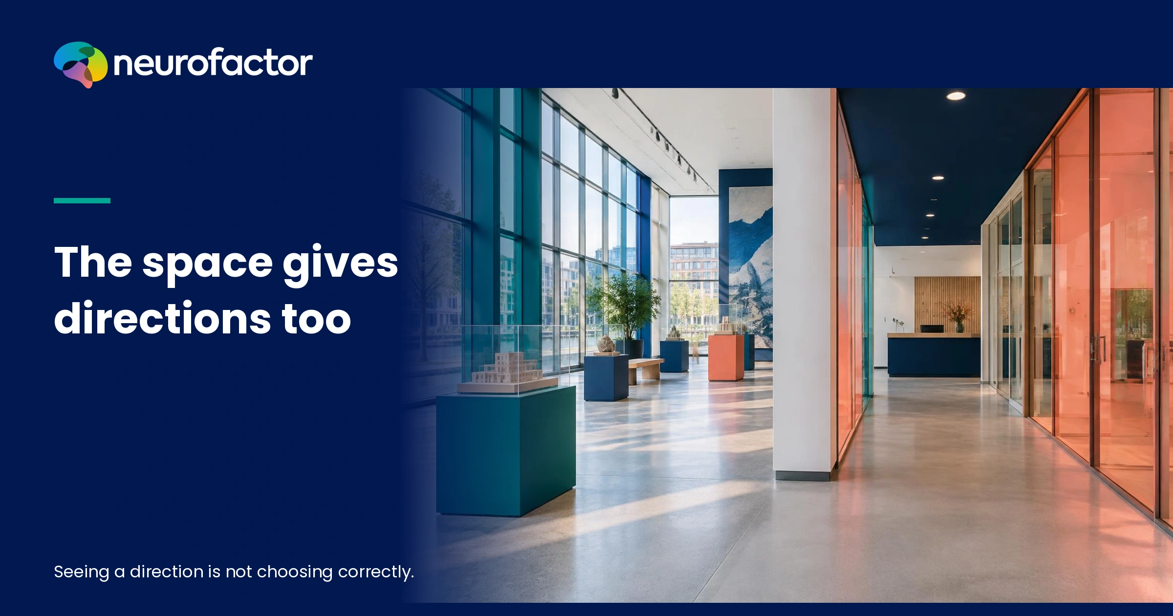
How do environmental associations influence whether people choose the right route?
People do not choose routes through arrows alone. Lighting, width, sightlines, destination wording, previous experience and landmarks can suggest which passage is public, plausible or usable. A shorter path can therefore seem less intuitive than a longer one. Studies in physical buildings and simulated route environments show that layout complexity, signage and spatial cues affect navigation, but outcomes vary by task and context [S2][S3][S9]. Investigate what visitors expect at a junction, which direction they actually take and what intervention improves performance. An environmental association is a testable interpretation, not a hidden navigation switch inside the brain.
The first route decision happens before the arrow is read
Imagine entering a large public building for the first time. To your left is a spacious, well-lit hall. On your right is a narrower corridor with a sign pointing towards your destination. On a floor plan the decision seems obvious: follow the sign. In practice you also interpret daylight, width, visibility and whether a passage appears open to the public. In experimental studies, participants sometimes preferred brighter or wider corridors, including when environmental information competed with signs [S7][S9]. This does not mean everyone automatically follows the light. It means that a space already communicates something before a written instruction is processed. Design teams should investigate that meaning rather than assuming more arrows will fix a confusing building.
A useful route is not necessarily the shortest route
For a facilities manager, a route is often a line connecting two points. For an unfamiliar visitor, it is a sequence of decisions: can I go through this door, am I still on the correct path, can I recognise the next turning, and how will I recover from a mistake? A short route can feel mentally demanding when it contains repeated turns or unexplained thresholds. A slightly longer route through familiar landmarks may be easier to understand. That is a hypothesis, not a universal preference. Research on route planning found differences between the route people actually walked and the route they would describe to somebody else [S12]. Asking for directions or showing a floor plan cannot replace observing how people navigate.
What are environmental associations in wayfinding?
An environmental association is a meaning evoked by a physical cue within a particular situation. An open entrance may suggest public access; an unmarked door may suggest staff-only space; a bright visible destination may suggest reassurance; a repeated colour or shape may suggest continuity. The same cue can evoke different interpretations. One visitor experiences a quiet corridor as calm, while another finds it deserted. These are research hypotheses, not previously measured Neurofactor scores. Studies of architectural legibility have linked layout complexity to disorientation and observed wayfinding performance [S1][S2]. They do not show exactly how every individual feels. A responsible association study must therefore connect people’s explanations, the physical context and their actual choices rather than equating architecture with a fixed emotion.
A building tells a story before the signage does
Consider a hospital, conference centre or municipal service building. Flooring changes, the ceiling becomes lower, lighting narrows or a reception desk appears directly ahead. Together these cues can imply a main public route, a secondary passage or a boundary between visitor and staff areas. Previous experience also matters. Someone accustomed to large transit stations may interpret an open stairwell differently from somebody who rarely enters complex buildings. The research question is which signals are noticed, what words people use to interpret them and where they then walk. Never infer from an attractive corridor that people will find the correct destination. A coherent design makes the intended direction recognisable at the moment a choice is necessary.
A sign can be accurate and still arrive too late
Directional signage provides explicit information, but visitors must notice, read and interpret it. A sign positioned beyond a junction may be correct while failing to guide the actual decision. Several signs using inconsistent department names can add uncertainty. In a factorial experiment involving building layouts and textual or graphic signage, text signs reduced errors such as wrong turns and backtracking, while graphic signs supported faster movement in that setting. Complex layouts nevertheless remained difficult [S3]. These results are not proof that one sign type always wins. They show why location, wording, route and task must be assessed together. Adding more arrows without addressing a confusing junction may leave the central problem untouched.
Table 1 - what an environmental cue may suggest
Association-based route research begins with visible features that can be tested. Lighting, corridor width, door design, colour and visible destinations do not have permanent psychological meanings, but they can shift expectations. Compare each plausible interpretation with an alternative explanation and a measure of what people do. A corridor may be brightly lit because of daylight, not because it is the intended route. Use this table during a diagnostic walk-through with visitors and then examine whether stated expectations correspond to actual movement. The suggested meanings are hypotheses rather than findings from the fictional location. The comparison is a safeguard against treating an appealing design story as behavioural evidence.
Wide illuminated hall
- Possible association
- This is the main route
- Alternative explanation
- This only leads to an exhibition
- What to test
- First turn and goal arrival
Unremarkable doorway
- Possible association
- Staff only
- Alternative explanation
- Intended public passage
- What to test
- Access interpretation
Coloured floor line
- Possible association
- Follow this line
- Alternative explanation
- Decorative brand campaign
- What to test
- Continuation at junctions
Prominent staircase
- Possible association
- I should go up here
- Alternative explanation
- Necessary lift is elsewhere
- What to test
- Step-free route findability
Distinctive artwork
- Possible association
- I recognise this point
- Alternative explanation
- Object appears after the choice
- What to test
- Landmark recall and behaviour
Image
First-time visitors do not navigate like experienced staff
People familiar with a building can use a known shortcut, central lobby or internal stair that an unfamiliar visitor would never recognise. New arrivals depend more heavily on what is visible from their present position. In an empirical study with 128 volunteers in three hospitals, the relationship between spatial configuration and navigation changed as people became more familiar with the setting [S4]. That finding does not establish a single learning pattern for all visitors. It does show why staff members’ confidence is not a reliable substitute for visitor testing. Examine first-time users, returning visitors and staff separately, while avoiding the assumption that somebody’s job title determines a fixed spatial ability or emotional response.
Multi-level buildings invite different navigation strategies
Imagine a destination on the third floor. One visitor first looks for a lift and then searches horizontally. Another starts walking towards the apparent location of the destination, before considering a change of level. A third sticks to the familiar main hall even when that requires a detour. Research in a complex multi-level building described floor-oriented, direction-oriented and central-point strategies [S6]. The architect’s preferred route is therefore not necessarily the path the visitor first considers. Make information available where these strategies diverge, especially around lifts, stairs, large lobbies and transitions between building sections. Observe which strategies people actually adopt before introducing a new numbering or colour system.
A memorable landmark may help more than another arrow
A landmark may be a distinctive staircase, a sculpture, a coloured wall or a highly visible service desk. It is useful when people can recognise it at the relevant decision point and later refer to it consistently. Research in unfamiliar polyclinics explored the importance of landmarks and spatial differentiation; importantly, successful navigation and the ability to sketch a complete floor plan did not always coincide [S5]. A visitor may therefore reach the destination without forming a comprehensive mental map. Choose landmarks that are stable, accessible and independent of temporary promotional campaigns. A landmark should support, not replace, essential accessibility instructions, destination labels or emergency signage.
Use destination names that match what people seek
'Public Services Unit 3B' may be an accurate internal department name while a visitor searches for 'collect my passport' or 'blood test appointment'. That mismatch is a semantic wayfinding problem. Ask visitors which words they expect to see before they start and check whether those words remain consistent across invitation, website, check-in screen and physical signage. Avoid assumptions about literacy, culture or preferred language. Test comprehension directly with people who use the building, including those who do not read the primary language fluently. Pictograms may help, but their meaning is not automatically universal. Effective route copy answers the immediate decision without filling every wall with organisational jargon.
Emergency evacuation requires a separate safety assessment
An ordinary visitor wants to reach an appointment with minimal uncertainty. During an emergency, priorities, available information and legal requirements differ. Virtual emergency studies have reported preferences for wider or brighter corridors, but those experiments do not validate any particular evacuation plan [S8][S9]. The brightest route is not necessarily the safe exit. Statutory escape route signs, professional fire-safety assessment and accessibility requirements must take priority over an attractive environmental association. Do not use unexpected live evacuations as a marketing experiment. Treat simulation results as prompts for targeted design questions only, while qualified specialists evaluate emergency planning. This article primarily concerns routine wayfinding in public physical spaces.
Observe hesitation just before the wrong turn
Good field observation records more than whether a participant eventually reaches the destination. Record where someone pauses, looks around, searches for a sign, retraces steps, asks for assistance or approaches an incorrect door. Also record which signs and destinations were visible at that moment. This provides more actionable evidence than an after-the-fact question about whether the route felt clear. Use anonymous observation when identifiable video is unnecessary. Individual tracking requires appropriate consent and a defensible legal basis. Allow participants to explain their behaviour afterwards: they may have been rushed, followed an outdated instruction or encountered a temporary obstacle. Avoid automatically attributing every pause to building design.
Table 2 - different users, different decision questions
Visitors do not arrive with identical tasks, experience or mobility requirements. A first-time visitor seeks confirmation. An employee draws on routine. Someone with a stroller requires a genuinely accessible route. A delivery driver may need a particular loading entrance. These are situational needs, not fixed personality types. The table connects each context with plausible associations, relevant evidence and a design risk. It also explains why the 'average visitor' is often an inadequate success criterion. A design that reduces average travel time while making an accessible route harder to find is not a successful redesign. Explore meaningful differences with care for privacy and without identifying small groups.
First-time visitor
- First question
- Am I heading correctly?
- Potential misreading
- Broad gallery seems right
- Useful test
- Unaided initial journey
Returning employee
- First question
- Is my usual shortcut open?
- Potential misreading
- Former side door still preferred
- Useful test
- Temporary detour
Visitor with stroller
- First question
- Can I avoid stairs?
- Potential misreading
- Lift entrance appears private
- Useful test
- Observe step-free access
Non-native reader
- First question
- Do I recognise this label?
- Potential misreading
- Internal terminology confuses
- Useful test
- Wording comprehension
Delivery driver
- First question
- Where is goods reception?
- Potential misreading
- Public desk looks appropriate
- Useful test
- Correct delivery entrance
Fictional case - Kompasplein Service Centre
Kompasplein Service Centre is an entirely fictional building offering public appointments, workshops and deliveries. Its ground floor has a broad, bright gallery towards an exhibition space and a narrower passage leading to service counters and lifts. A small sign reads 'Counters B'. At the far end of the bright gallery, a colourful exhibition poster attracts attention. Staff describe the service-counter route as perfectly straightforward because they know the turn by heart. This is not an actual client case, Neurofactor study or measured intervention. The fictional setting illustrates hypotheses that a real research protocol might investigate. No invented conversion rates, travel-time reductions, reaction-time findings or EEG scores are presented as research results.
Amal looks for a counter, but the space seems to invite her elsewhere
Amal visits Kompasplein for the first time with an appointment confirmation on her phone and a stroller. She notices the daylight and open gallery. The smaller passage appears to her as though it might lead to a staff area. In this hypothetical story she initially chooses the gallery and later looks for another sign. The issue is not whether Amal is 'bad at finding directions'. It is why a route obvious to the manager communicates something else to a newcomer. A real test could investigate whether clearer destination wording, a more visible entrance towards the lifts or a landmark improves route choice while preserving a fully accessible path for the stroller.
Thomas knows the site and barely looks at the signs
Thomas is a returning supplier in the same fictional scenario. He heads immediately towards a side door used during previous deliveries. When that door is temporarily closed, his learned routine conflicts with new instructions. He is not a magically competent 'experienced user'; familiarity helps only while current conditions sufficiently resemble past experience. Research on wayfinding and building familiarity supports treating prior knowledge as a separate explanatory factor [S4][S6]. A proper assessment would test whether detours and temporary closures remain clear without forcing anyone towards an unsafe or inaccessible passage. For Amal and Thomas, the same entrance hall imposes very different cognitive demands.
Image
The first junction is a decision point, not a decorative feature
Errors often become visible at transitions: the entrance, a T-junction, a lift lobby or the top of an escalator. Information should be available before the decision and confirmed at the next step. An arrow beside the turn does little if the visitor cannot match the department name to the goal. Research on spatial visibility has related the geometry of what can be seen from junctions to how route knowledge develops [S10]. This is not a ready-made formula for every building. Photograph the crucial path from normal visitor eye height and ask what a newcomer can actually notice. Include obstructions, temporary queues and objects that may change the line of sight.
A coloured floor line may reduce one confusion and create another
Suppose Kompasplein considers a blue floor line towards the counters. Regular visitors might learn it quickly, while others may assume the colour belongs to the exhibition campaign. At a crowded junction the line could disappear behind people or blend into a floor pattern. Do not merely test whether the colour looks appealing. Test whether participants understand, follow and continue the route at a second decision point. Colour should never be the only channel: combine it with names, direction, form and appropriate tactile or audible support. Ask what people expect when the line ends. An attractive graphic system is not necessarily a dependable navigation system.
The shortest path may be harder to explain and follow
A route optimised for distance can still create cognitive detours. Visitors may favour a longer central hall because they recognise a lift, an information desk or a clear view towards daylight. Research in familiar urban environments found differences between walking a route and describing one to another person [S12]. It supports attention to task and available information, not a universal equation for the best indoor route. Define success before designing: is the goal solely to reduce metres travelled, or also to reduce wrong turns, backtracking, uncertainty and help requests? Evaluate these outcomes separately and make physical accessibility an absolute design condition, rather than an average performance indicator.
Table 3 - match the route problem to a testable intervention
Another sign is only one possible design response. Sometimes a better sightline to the destination matters more. Sometimes names must become consistent. In other settings an architectural boundary should become more legible or an accessible route should connect more naturally with the main visitor route. This comparison connects diagnosis to a small reversible variant and a potential unintended consequence. Include the existing environment as a control condition. Doing so prevents every experiment from becoming a sales pitch for a new colour or pictogram. Define in advance what improvement would justify a change and which users might lose out. Successful wayfinding is not simply a higher overall average.
Destination naming mismatch
- Reversible variant
- Use booking-confirmation wording
- Primary outcome
- Correct first turn
- Possible downside
- Text overload
Arrow arrives too late
- Reversible variant
- Cue before the junction
- Primary outcome
- Backtracking count
- Possible downside
- Visual clutter
Lift route difficult to see
- Reversible variant
- Visible step-free entrance
- Primary outcome
- Independent arrival
- Possible downside
- Crowding or glare
Repeated identical corridors
- Reversible variant
- Landmark at choice point
- Primary outcome
- Recall and wrong turns
- Possible downside
- Maintenance and ambiguity
Temporary closure
- Reversible variant
- Consistent detour signage
- Primary outcome
- Unaided arrival
- Possible downside
- Unsafe alternatives
Create an information hierarchy rather than a wall of signs
A route system may use destination names, floor numbers, colour codes, arrows and pictograms. They work together only when they reinforce each other and appear in a coherent sequence. Begin with the question somebody needs answered: which direction now, which floor, or is this entrance open to me? Give that message priority and move secondary details to the point where they become necessary. Keep names consistent from the booking confirmation through the entrance and each junction. Test the hierarchy with unfamiliar visitors. When people must search harder for the sign than for the corridor, the problem may lie in where the information is presented rather than how much there is.
Use lighting to support visibility, not to imply safety
Virtual route-choice experiments found that brighter passages attracted choices in some conditions [S7][S8]. Lighting is therefore worth studying as a contributor to legibility. But attracting people to a well-lit passage is counterproductive if the destination is elsewhere. Light also brings practical issues: glare, contrast, energy use and different visual needs. Test whether the intended route becomes easier to perceive without making other essential signs unreadable. For emergency exits and accessible routes, standards and professional safety assessments take precedence. Treat lighting as one component of a coherent wayfinding system, not a psychological switch that can steer every visitor in the same way.
Put landmarks where the memory needs them
A landmark becomes useful when it is noticeable at a choice and easy to recognise or describe again. A striking sculpture in a grand entrance may be memorable while offering little help at the rear junction where visitors repeatedly make errors. Place cues near actual decision points and evaluate what visitors remember. Experiments investigating local and global landmarks in virtual environments found that different forms of landmark information can affect route knowledge [S11]. This does not make every artwork a wayfinding tool. Choose stable and accessible elements that can survive changes in branding or tenant occupancy, and make sure essential destination and safety signs remain clearly visible.
Make the accessible path as intuitive as the main path
A building may have an obvious staircase while its step-free lift route hides behind an unmarked door. The space then communicates that some visitors can take the 'normal' route while others must search. Accessibility is a baseline requirement, not a marketing segment. Test with relevant users, including people with mobility aids, reduced stair mobility and visual access requirements, whether every essential path is findable and usable. Avoid unsolicited diagnoses or unsafe experimentation. Record whether the lift actually works and where an alternative route leads during a closure. An arrow towards an inaccessible path is not an effective arrow. Make step-free routes as coherent and consistently named as any other primary route.
Environmental associations are not secret commands inside the brain
A rapid word response, prolonged gaze or physiological change may provide useful additional information, but cannot independently explain why someone turns left. Eye tracking can indicate where someone looks, not automatically what they understand. Association tasks can help frame hypotheses, not reveal a single hidden 'correct route' inside a visitor. EEG in a real-world setting may supplement a justified research question but does not prove secret route intentions or diagnose navigation ability. Combine methods with interviews, physical features and observed choices. Do not add neurotechnology because it sounds impressive. Responsible measurement starts from a falsifiable design question rather than from the equipment available.
What the primary studies actually establish
The evidence base includes observational studies in real buildings, controlled signage experiments, simulated junction choices, route-learning tasks and a cluster-randomised trial in long-term care [S1]-[S14]. Together, they do not prove that a specific colour, light level or sign type will guide every visitor correctly. In a study across 15 long-term care communities, environmental cues improved aspects of route performance and reduced errors, yet no improvement was found in the broader life-space outcome [S13]. Outcome selection matters. Translate a plausible mechanism into a site-specific hypothesis, test it with real users and report disappointing outcomes as carefully as apparent successes. Laboratory or virtual results need validation before being generalised to a busy public building.
Three responsible changes worth testing first
Start by checking that the destination on the appointment confirmation matches the words on the first entrance sign. Next, place an unambiguous confirmation cue before the junction where hesitation is common. Finally, examine whether the entrance to the accessible main route can be made more visible. These are possible interventions, not guarantees. Define the measures in advance: first turning decision, backtracking, help requests and reported uncertainty. Look for unintended effects, including congestion and a less visible alternative path. A change that benefits one visitor group while consistently disadvantaging another should not be presented as successful merely because the average journey becomes faster.
A familiar word may matter more than an elaborate design
Ask visitors where 'North Public Services - sector C2' should be found. Their answer may have little to do with the organisation’s internal structure. Someone may be looking for 'renew my driving licence' and never connect that task with 'Identity Documentation Team'. Connecting the visitor’s language to the destination label could make the route easier to follow. Test this through a real task without giving away the answer during the interview. Do not assume that a particular nationality, literacy level or stressful appointment predicts an individual’s navigation behaviour. Measure actual comprehension. Effective route wording is concrete, consistent and visible at the decision point where it matters.
Research protocol step 1 - define destinations and decision points
Select representative journeys such as entrance to appointment desk, lift to meeting room and entrance to an accessible toilet. Confirm the intended route with facilities specialists, including safety and accessibility constraints. Map the critical intersections, sightlines, current wording and known points of hesitation. Formulate explicit association hypotheses, for example that a wide illuminated hall appears publicly accessible to new visitors while a narrow passage appears private. Record alternatives such as unfamiliar departmental names or temporary barriers. Define the primary outcome before any participant starts, whether fewer incorrect first turns, less backtracking or more reliable use of the accessible path. Predefine conditions under which an intervention should be rejected.
Research protocol step 2 - collect expectations without leading the route
Invite participants voluntarily and ask before the journey what entrance, destination labels and cues they expect. Allow them to describe what a main public route or staff passage would look like. Use neutral language and record relevant prior familiarity. Collect only necessary personal information. Age, health history and ethnic background are not default prerequisites for evaluating a corridor. Provide accessible study information, genuine consent and the ability to decline. Early statements produce hypotheses, not a stable personality classification. Check that terms used in multiple languages refer to equivalent concepts. Keep a record of possible interviewer influence and contradictory observations to prevent confirmation bias.
Research protocol step 3 - observe real choices under realistic conditions
Ask participants to complete safe, accessible tasks with minimal route-specific prompting. Record the first chosen direction, wrong turns, pauses, backtracking, requests for help and successful arrival, preferably in aggregated form. Capture the number and nature of decision points as well as elapsed time. Run observations across relevant busy and quiet periods and record temporary closures. Avoid identifiable video if anonymous observation meets the objective. Minimise researcher presence so the study does not become a performance test. Stop promptly when there is a safety concern. The goal is not to deliberately get people lost, but to understand the wayfinding demands of the existing environment.
Research protocol step 4 - test interpretation using proportionate methods
Immediately after the route, ask which signs, passages or landmarks helped and where uncertainty arose. Match these accounts to observed decisions rather than asserting hidden unconscious mechanisms. Add a word-association or response-time task only when it addresses a specific question and has been piloted for clarity and repeatability. Eye tracking may help locate attention, but cannot independently establish understanding. Document method limitations and potential demand effects. Do not infer individual cognitive capacity, cultural competence or medical status. If physiological or neurological measures are proposed, require a separate ethical and scientific justification and treat them as optional complements, never mandatory assessments of visitors.
Research protocol step 5 - compare small design variants
Compare, for example, A: existing signage, B: consistent destination naming, and C: an additional landmark before the first junction. Keep route availability and other conditions similar where possible. Allocate variants responsibly across comparable periods, accounting for order, crowding and familiarity. Avoid major simultaneous interior and communications campaigns if the aim is to estimate the local effect of a single change. Track the same predefined outcomes and unexpected adverse effects in each condition. A short pilot supports a decision but does not automatically prove causation. Safety-critical routes, healthcare processes and complex accessibility requirements need dedicated expert assessment beyond a commercial wayfinding study.
Research protocol step 6 - evaluate behaviour, accessibility and experience
Evaluate more than mean walking time. Check whether wrong turns and backtracking fell, how well visitors understood the cues, and whether people with different route requirements could reach the destination independently. Compare relevant contexts without exposing small or identifiable groups. Report null and negative findings. Decide whether a change is maintainable and works across languages, floors and temporary detours. Assign responsibility for keeping labels and routes up to date; otherwise a good system can gradually become confusing again. Explain what changed and what remains uncertain. This is stronger evidence of value than a few enthusiastic comments about a new sign system.
Table 4 - which method answers which question?
A wayfinding project can look convincing because it produces dashboards and heatmaps. Yet a gaze heatmap alone does not tell us whether a visitor chose the correct turn. Mean journey time can conceal serious barriers to the accessible route. Connect every measurement with a precise question, a justified conclusion and the evidence it cannot provide. This table distinguishes what people say, what they notice, what they choose and what the environment offers. Without these distinctions, a design team can attach a false interpretation to an attractive visualisation. Use this matrix to determine whether any eye-tracking or neurophysiological methods add genuine value and can be deployed ethically.
Pre-route interviews
- What it can show
- Expectations and language
- What it cannot prove alone
- Actual first turn
- Combine with
- Route observation
Route observation
- What it can show
- Turns, stops and return paths
- What it cannot prove alone
- Motive or inner state
- Combine with
- Short debrief
Spatial analysis
- What it can show
- Sightlines and junctions
- What it cannot prove alone
- Individual comprehension
- Combine with
- User tasks
Eye tracking
- What it can show
- Looking direction and fixations
- What it cannot prove alone
- Understanding of directions
- Combine with
- Task and verbal explanation
Association task or EEG
- What it can show
- Supplementary validated signal
- What it cannot prove alone
- Hidden route desire or safety
- Combine with
- Triangulation and validation
Accessibility, privacy and research ethics are part of the design
Wayfinding research takes place in buildings used by people who have not agreed to participate. Favour anonymous observation and avoid recording identifiable visitors where possible. Provide clear withdrawal options to participants. Paths to healthcare or public services may reveal sensitive personal information; collect only what is essential and confirm the GDPR basis. Never create an experiment that sends people towards an unsafe door, inaccessible stair or restricted area merely to observe an 'intuitive' decision. Consult accessibility specialists and users with relevant experience. A high route-performance score has limited meaning unless the design also respects safety, rights and personal dignity.
A route can be logical on paper and illogical in the building
The central mistake in wayfinding is assuming that a correct floor plan or well-intentioned sign is sufficient. People interpret light, width, thresholds, destination words and landmarks at the moment they must decide where to go. The same building can prompt different strategies in first-time and experienced visitors. Primary studies show relationships between architectural legibility, signage, spatial cues and navigation while also revealing dependence on context and task [S2][S3][S4][S9]. Do not start by ordering more arrows. Start by discovering which path a visitor perceives as obvious, and whether that perception matches the intended, safe and accessible route.
The next improvement starts with the first wrong decision
On your next site visit, do not begin with the architectural plan. Stand where an unfamiliar visitor must choose, and examine what information is visible at once. Compare the visitor’s initial expectation with the first turn, any backtracking and eventual arrival. Make one proportionate change that addresses the diagnosis: a name, sightline, landmark or clearer step-free connection. Measure again and record the limits. The value of environmental association research is not to manipulate everyone secretly into taking a path. It is to make reaching the right destination independently, with dignity and without unnecessary doubt, easier for the people who use the space.
Key terms
- Wayfinding
- Recognising, selecting and following a route to a destination within a physical setting.
- Environmental association
- A context-specific meaning or expectation evoked by a spatial feature, not a universal effect.
- Cognitive map
- An internal representation of spatial relations, places and connections that can support navigation.
- Architectural legibility
- The extent to which a building makes spatial connections and navigable paths understandable.
- Landmark
- A recognisable spatial feature that people notice, remember or refer to while navigating.
- Accessible route
- A usable, findable connection for people with different mobility and sensory requirements.
Frequently asked questions
Why do visitors walk past a correct sign?
They may not notice it in time, expect another destination label or interpret competing spatial cues as more plausible. Observe the local context before assigning a cause.
Is the shortest route always the best route?
No. Legibility, backtracking, recognisable junctions, safety and accessibility may matter more than a small reduction in distance.
Does brighter lighting always improve route choice?
No. Some experiments found a preference for brighter corridors, but brightness does not guarantee that a route is correct or safe.
How do you research environmental associations?
Combine neutral expectation questions with observation of first turns, wrong turns, requests for help and arrival. Test small design changes with proper comparisons.
Can EEG reveal which route someone unconsciously wants?
No. EEG and eye tracking may offer supplementary information, but cannot independently establish hidden route intentions, comprehension or safety.
Sources
- 1.Evaluating Architectural Legibility: Way-Finding in the Built Environment
- 2.Evaluation of a Conceptual Model of Architectural Legibility
- 3.Effects of Signage and Floor Plan Configuration on Wayfinding Accuracy
- 4.Just Down The Road A Piece: The Development of Topological Knowledge of Building Layouts
- 5.Wayfinding in an Unfamiliar Environment: Different Spatial Settings of Two Polyclinics
- 6.Up the Down Staircase: Wayfinding Strategies in Multi-Level Buildings
- 7.Using environmental affordances to direct people natural movement indoors
- 8.The influence of environmental features on route selection in an emergency situation
- 9.Effects of competing environmental variables and signage on route-choices in simulated everyday and emergency wayfinding situations
- 10.From Isovists via Mental Representations to Behaviour: First Steps toward Closing the Causal Chain
- 11.The effect of landmark and body-based sensory information on route knowledge
- 12.Would you follow your own route description? Cognitive strategies in urban route planning
- 13.A Cluster Randomized Controlled Trial of Visual Cues, Signage, and Spaced Retrieval for Wayfinding Within Long-Term Care Communities
- 14.Walking improves your cognitive map in environments that are large-scale and large in extent
Read next
Reviewed by: Martijn den Otter
Martijn den Otter
Oprichter van Neurofactor. Expert in neuromarketing en consumentenpsychologie.
LinkedIn →