
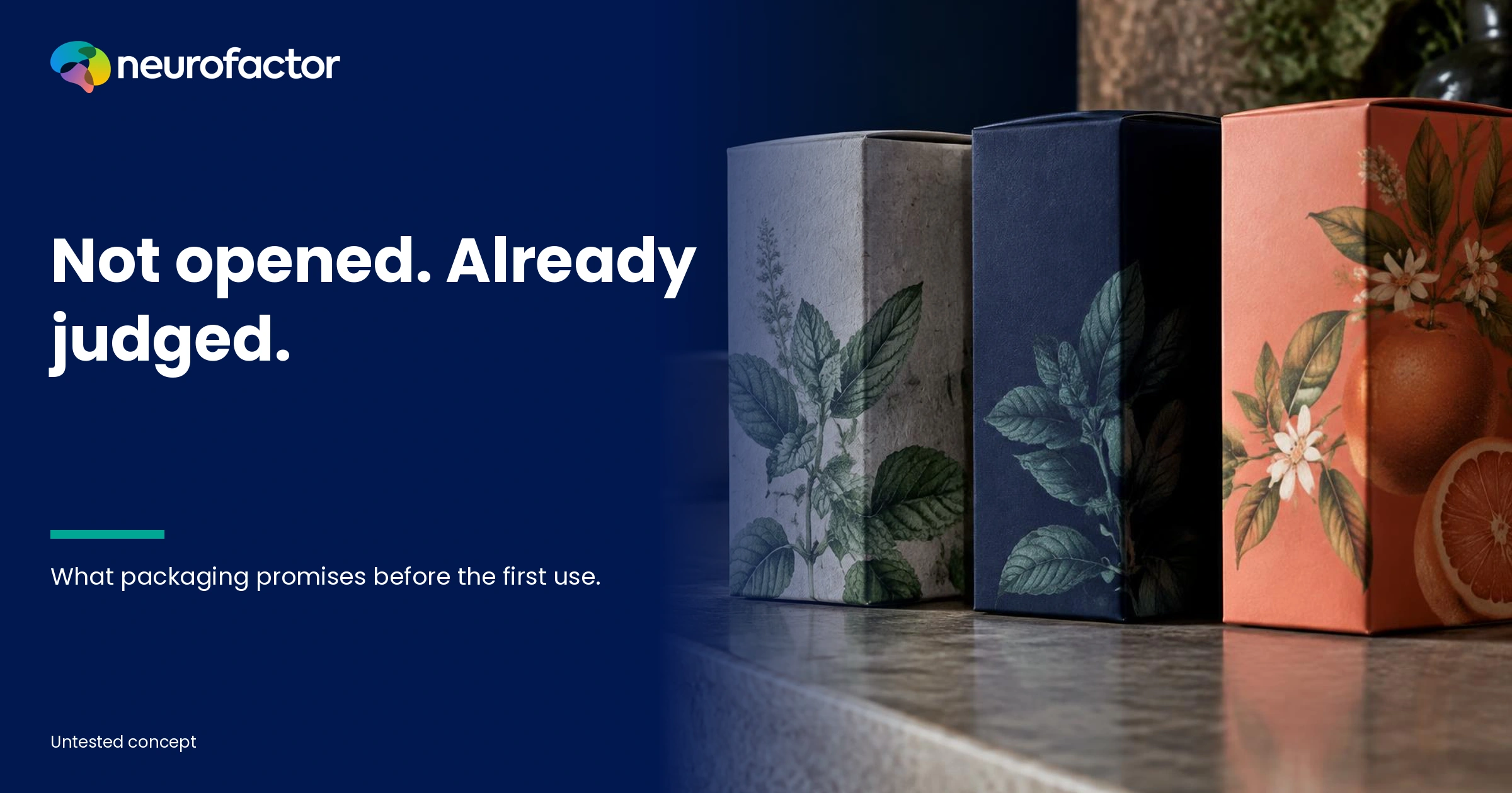
The pack is still closed. Your brain has already judged the product.
A bottle feels heavy. A carton looks restrained. A label has generous empty space, a tiny logo and hardly any explanation. Before anyone smells, tastes or uses the contents, a judgment has begun to form: premium, natural, complicated, inexpensive, reliable or perhaps exaggerated. Not because cardboard can reveal the true quality of what is inside. It is because people connect visible and tactile cues with previous experiences, category conventions and expectations.
That sounds like a small matter for the design department. Until the same pack communicates high quality and unnecessary waste at once. Or an elegant new visual identity fits the brand strategy but makes the product variant impossible to recognise. Packaging is not a neutral protective shell. It communicates before the product itself has provided evidence. The important question is whether that communication survives the encounter with what people actually buy and use.
AI summary: Packaging can create associations with quality, taste, performance, price, sustainability and brand identity through colour, shape, size, material, texture, imagery and words. Scientific studies support effects on expectations and judgments in defined contexts, but do not establish a universal design formula or a guaranteed sales impact. Investigate separately what shoppers notice, the meanings they infer, what they understand and what they actually select or do. Compare expectations with the product experience, using association research, realistic selection tasks, physical prototypes and eye tracking where relevant. Never confuse a premium impression with verified quality or a natural-looking surface with demonstrated sustainability.
Packaging speaks before the product can prove anything
A product does not arrive on a shelf without a history. People have bought coffee, held shampoo bottles, opened cartons and learnt that a certain weight or finish sometimes signals careful construction. The mind can use these experiences to classify something unfamiliar. This is the associative meaning of packaging: features become cues, cues create expectations and expectations can influence the next decision.
That is not a hidden purchase switch. Someone can think 'looks excellent' and still find the price unacceptable. Another shopper can notice a distinctive package yet reject it because the contents are irrelevant. A loyal customer may trust the same brand despite being indifferent to its new design. A product association is one ingredient of the decision, never the whole recipe.
Orth and Malkewitz investigated how holistic package designs relate to consumer brand impressions. Their research distinguished design configurations such as natural, delicate, contrasting and massive. [2] The practical lesson is that a single design element rarely operates in isolation. The meaning of a colour may change when paired with a different shape, material, message or existing brand. Optimising one colour value without studying the full composition may improve a test stimulus while weakening the total design.
A 2026 meta-analysis by Callebaut and colleagues synthesised 1,213 effects from 280 studies reported in 119 papers. [1] It examined eight visual packaging elements, including size, colour, shape, material, imagery, backgrounds and text. Importantly, effects differed depending on the outcome being studied. Some visual elements influenced impressions of the package more strongly than inferences about the contents or actual behaviour. Liking a package, expecting a good product and buying that product are three different outcomes. They deserve three different interpretations.
This is why 'the redesign performed significantly better' is not a sufficient conclusion. Better at attracting attention? Easier to find in a competing range? More accurately signalling product quality? Helping a shopper select the correct version? Reducing complaints after opening? Without a specific answer, the research result can become a sophisticated way to describe an internal design preference.
Eight associations a package may create
The matrix below is a diagnostic framework, not a list of guaranteed consumer responses. The same material feature may generate several meanings at once. The final column specifies the question that must be tested rather than assumed.
| Possible association | Cue that may support it | Possible competing response | What the research must establish |
|---|---|---|---|
| Quality and craftsmanship | Solid closure, careful finishing, coherent form | Unnecessarily expensive or overpackaged | Does the expected quality agree with product evidence and later use? |
| Naturalness | Paper texture, earthy hues, botanical imagery | Cheap, unhygienic or greenwashing | Is this an impression or a verifiable property? |
| Premium positioning | Restrained typography, depth, refined finish | Distant, exclusive or unaffordable | Does the meaning fit the intended buying context and price? |
| Reliability and safety | Clear origin, instructions, closure and consistent information | Clinical, complicated or suspiciously reassuring | Which specific risk remains, and what proof exists? |
| Flavour and intensity | Saturation, curves, fruit images and material appearance | Artificial, overpowering or misleading | What is expected before tasting or using the product? |
| Ease of use | Obvious opening, dosing system and legible instructions | Flimsy, simplistic or inconvenient | Can people open, use, store and dose the actual pack? |
| Sustainability | Refill cues, compact form and material appearance | Unsupported claim, fragility or more waste | What is demonstrably true of the materials and life cycle? |
| Brand identity and belonging | Visual language, symbolism and category recognition | Not for me, overly youthful or old-fashioned | Which contexts support recognition, without stereotyping people? |
One common mistake is to place every desired adjective into the creative brief: natural, luxurious, affordable, safe, modern and distinctive. In some categories, those meanings can conflict. A luxury container may communicate care to one buyer and waste to another. Paper may look authentic yet suggest vulnerability if the product must tolerate moisture or repeated use.
Do not ask only which association a redesign should create. Ask which meanings already exist, which undesirable inferences might follow and whether the actual product can fulfil the promise. A neutral score can also mean that the brand is unfamiliar, the stimulus was poorly presented or the task was ambiguous. Diagnose those possibilities before assigning the problem to graphic design.
Five moments when packaging meaning changes
Moment 1 - Expectations before the shelf. Shoppers arrive with a task, budget, earlier category experiences and memories of brands. A brand may already be associated with trust or high prices. Unless you measure these pre-existing meanings, you may attribute the effect of brand history to a new box. Record what people believe before the proposed design appears.
Moment 2 - The first visible selection. From a distance, size, main colour, silhouette and prominent words may matter. A package that stands out may be noticed sooner, but attention can also follow an odd or unappealing feature. Being seen is not the same as being chosen. A realistic display needs competitors and a genuine task, including the option to pick nothing.
Moment 3 - Closer evaluation. The buyer now needs to recognise the variant, quantity, use case, price and relevant claims. Is the type readable? Does an icon have an unambiguous meaning? Can someone explain the product? A shopper may admire the design but remain unable to tell what is inside. A single liking question will not detect that failure.
Moment 4 - Touching and opening. In a store, people may experience weight, texture, sound and rigidity. At home, the opening, dosing and unboxing process add information. Krishna and Morrin demonstrated in experimental contexts that haptic properties of a container can affect judgments of its contents, with differences between participants. [3] This does not establish that heavier packs are always better. It does establish why physical prototypes deserve their own evaluation rather than being replaced with digital renders.
Moment 5 - First and repeated product use. Taste, scent, actual functionality and ease of use provide information that a closed pack could only suggest. Research by Tijssen and colleagues on repeated consumption indicates that intrinsic properties such as taste can come to dominate product evaluation. [8] Strong initial expectations are therefore not necessarily an asset if the experience fails to match them. A first purchase and a positive long-term relationship are separate achievements.
These are analytical moments, not five neurological modules or a compulsory straight funnel. People may revisit a package, compare brands and revise their opinions after use. The distinction is useful because different questions need observations at different stages. Showing a participant one sealed carton in a survey cannot tell you how that carton opens, pours or survives everyday handling.
Colour, shape, material and language promise different things
Colour is not a universal translation chart where green always means sustainable and black always means premium. Spence and Van Doorn explain how many visual associations emerge from learnt market regularities, previous experiences and cultural conventions. [5] The colour that identifies a familiar flavour in one country may refer to a different variant elsewhere. Even within one country, the same hue may stand out among certain competitors and disappear among others.
Shapes can also influence expectations about what is inside. Velasco and colleagues reviewed crossmodal correspondences between shape and taste. [6] Under particular conditions, roundness and angularity may be associated with different sensory attributes. Becker and colleagues manipulated package form and colour saturation when studying expectations and evaluations of yoghurt. [4] These findings are useful for generating research hypotheses. They are not proof of a universal 'sweet font' or a shape that guarantees a stronger product.
Material communicates practical as well as symbolic information. A robust seal can inspire confidence in the closure. A rough surface may evoke craft. A light container can be convenient to transport but may also seem less solid. One individual may value both meanings or reject the trade-off. If touch matters to the decision, compare physical packs instead of making the entire argument from exceptionally polished 3D images.
Text and imagery do another job: they can communicate facts that should be checked. Fruit photography may suggest a flavour, but it must not imply an ingredient that is absent. 'Refillable' calls for a working refill system. A term such as 'natural' may be interpreted far more broadly than the stated facts support. A literature review by Schifferstein, de Boer and Lemke discusses how wording, pictures and style influence interpretations of food-packaging information, including potentially misleading implications. [7]
A responsible study therefore asks three separate questions: what did the shopper see, what conclusion did they draw and was that conclusion justified? A technically accurate text block can coexist with a misleading overall visual impression. Conversely, a striking visual can be entirely fair when the claims and the content are aligned.
Attraction and resistance can exist in the same design
People do not always hold one average opinion. A package can appear luxurious and wasteful, natural and unprofessional, playful and unreliable, elegant and distant. A single mean rating may conceal such tensions. A design awarded a moderate score by everyone might be less relevant than a design that communicates precisely to the people for whom the product is actually suitable.
This is not an argument for deliberate polarisation. Some negative reactions reflect a real problem. A barely readable ingredient list is not sophisticated target-group differentiation. An oversized carton with little inside may create a misleading quantity expectation. A fragile closure does not become acceptable simply because 'minimalist' scores positively. Aesthetic appeal cannot replace information, product quality or functional safety.
Distinguish aesthetic liking, association with the contents, belief about a fact and expected personal value. 'Looks healthy' does not establish the nutritional content. 'This is my sort of brand' can matter to choice without measuring quality. 'Looks easy to open' should be tested with an opening task, including people whose strength, dexterity or vision differs from the designer's assumptions.
Segmentation should begin with the actual shopping context. Existing customers recognise brand codes that newcomers do not. A customer looking for a specific variation may need familiar category colours more than an artistic reinvention. A gift buyer may value presentation, while a daily user prioritises dosing, storage and waste. These are testable tasks, not permanent psychological properties of an age or job category.
Fictional case: the herbal infusion promising more than the label says
This entire case is fictional. The manufacturer, products, prices, customer reactions and design concepts are illustrations, not Neurofactor client measurements. No experiments, observed sales outcomes or measured preferences are being claimed.
Imagine a producer planning an herbal infusion with lemon balm and mint. The hypothetical retail price is EUR 8.95 for a carton of twenty tea bags. In this design exercise the contents, preparation and actual quality are identical. Three potential packages are being discussed. The team disagrees about what someone should feel at the first encounter.
Concept A - The natural story. A light-coloured box with a visible paper texture, muted green details and a botanical drawing. The designers intend to communicate calm, authenticity and craft. But someone may infer that the paper texture means a lower environmental impact. That is a hypothesis, not a verified advantage. Without evidence about materials, production and disposal, strong sustainability claims would not be justified. Another shopper might interpret the same design as a low-cost own-label product.
Concept B - The premium promise. Deep navy, ample negative space and carefully considered finishing. The team expects that a higher price will seem more reasonable. Yet it may also suggest strong tea, a gift product or something intended for special occasions. If the infusion itself has a delicate flavour and the shopper wants an everyday drink, there may be a mismatch. Asking whether people find this option more luxurious will not reveal that mismatch.
Concept C - The fresh signal. A bright coral accent with a large image of lemon and mint. It may be recognisable and energetic, but could also suggest sweetness, artificial flavouring or a soft drink. The actual ingredients are specified on the label. Even so, the imagery might create expectations that the contents do not meet. The expectation has to be tested; it cannot be inferred from the enthusiasm of the creative team.
The concepts are presented to management. Everyone has a favourite. And that is precisely the methodological problem. The company is in danger of treating an internal meeting as if it represented the associations of real customers shopping for a particular purpose. The chief executive prefers an understated identity; the retail buyer needs the pack recognised from two metres away; the product developer wants an honest representation of the aroma. All three raise legitimate but different questions.
An appropriate exploratory study would display the concepts at the same price and quantity among realistic category competitors. Participants would receive distinct tasks: find something for daily use, select a present, or identify a particular herb combination. The researcher would first record spontaneous recognition and selection, then associations, then more directed explanations. When physical prototypes are available, opening, handling and storage should be examined as independent tasks.
The next step would measure expected flavour before product use. Where safe and appropriate, participants could assess the same infusion without packaging information, then with the associated package. Comparing blind evaluation, expected taste and subsequent experience helps distinguish the effects of the packaging from the properties of the drink. If one concept implies a powerful taste while the infusion is mild, it may be visually appealing yet poorly calibrated. A less exciting concept might tell a more accurate story.
There is no winner in advance. The study might show that none of the packs make the variant clear, that the price positioning is problematic or that the product's actual sensory qualities are the main obstacle. The value lies in a decision about the pack, the communication or the product, not a fabricated bar chart announcing a winning colour. This fictional case illustrates a research process, not its result.
A nine-step research protocol
Step 1 - Specify the decision to be made. Are you launching a product, separating confusing variants, correcting a quality misconception or improving the way people use the package? Agree on a business question and a primary outcome before testing. 'Choose the best package' is not a measurable question. 'Help customers select the right variant without inaccurate flavour expectations' is much closer.
Step 2 - Define the defensible product promise. Record composition, use, quantity, material, verified claims, restrictions and price. Identify what has already been established and what still requires testing. Packaging research should never be an excuse to create unsubstantiated quality or environmental claims. What is actually inside the pack must anchor the design discussion.
Step 3 - Explore associations before showing the design. What does the brand already mean? What do shoppers expect from a mint-and-lemon-balm infusion? When do they describe a product as trustworthy, natural or premium? Use open-ended elicitation and document the order of tasks. Showing the proposed package first will shape subsequent responses. That can be appropriate when measuring an effect, but not when trying to establish a neutral starting point.
Step 4 - Observe selection in context. Give participants a realistic shopping assignment with competing products and permission to choose none. Consider price, display position, lighting, distance and available time. Track whether the pack is detected, recognised, understood and selected. An isolated, beautifully rendered image cannot demonstrate what would happen on a crowded shelf.
Step 5 - Map associations for each concept separately. Capture spontaneous words and meanings. If useful, employ validated or appropriately designed implicit association tasks, documenting their reliability and interpretive limits. Distinguish the product, the brand, the retailer and the container as separate objects. Fast responses to 'natural' do not prove that someone regards the item as environmentally preferable, much less that it is environmentally preferable.
Step 6 - Test comprehension and physical usability. Ask people to point to the quantity, recognise the variant, identify relevant claims and explain them in their own words. Where appropriate, observe opening, dosing, reclosing, carrying and storage. Include different accessibility needs. A label can be attractive and still fail the people who need to use it.
Step 7 - Measure expectation separately from experience. Before use, ask what people expect of taste, quality or ease of handling. Then test the experience in a controlled and, where feasible, realistic context. In food studies, blinded evaluations may help separate intrinsic product properties from the effects of visual presentation. State which variables are controlled and which cannot be isolated.
Step 8 - Compare the variants using a credible design. Prespecify the key outcome and change only the elements the research intends to compare. Controlled choice tasks and random assignment can be useful for shelf behaviour. Field experiments may be needed for claims about real purchase. Report actual sample sizes, uncertainty and contextual restrictions. A percentage improvement with no denominator is not credible evidence.
Step 9 - Follow the result beyond launch. Evaluate correct variant choice, repeat purchases, inaccurate expectations, returns, complaints, refill behaviour, packaging waste and subsequent product evaluations. A pack that wins an initial purchase by setting misleading expectations is not a lasting success. Assign responsibility for keeping material information and product claims accurate over time.
This is a decision framework, not a compulsory laboratory recipe. Not every packaging question requires EEG, an elaborate simulation or several hundred participants. A practical legibility task followed by a small controlled shelf test may be sufficient to uncover a specific design failure. Research intensity should reflect the size and risk of the decision.
From association to evidence: the expectation matrix
Packaging research becomes useful when the team can identify the meaning it wants the customer to infer, the actual evidence for that meaning and a customer or business outcome that can be checked. The following matrix is a conceptual example for the fictional infusion. None of its entries are measured findings.
| Intended meaning | Possible design communication | Evidence that would be required | Suitable outcome |
|---|---|---|---|
| 'The flavour suits my needs' | Ingredients, honest flavour descriptions and appropriate images | Actual recipe, ingredient list and sensory evaluation | Accurate expectation and assessment after tasting |
| 'This is a quality product' | Reliable closure and coherent presentation | Relevant quality and product information, not mere luxury cues | Perceived quality distinguished from measured quality |
| 'I recognise my variant' | Consistent category markers and clear variant name | Findability under realistic category conditions | Recognition time and correct selection |
| 'The price makes sense' | Transparent quantity, origin and product information | Accurate price and genuine product attributes | Perceived value and appropriate choice, not only premium ratings |
| 'This package is responsibly designed' | Precise material and disposal information | Verifiable material, reuse and recycling data | Correct understanding and actual disposal or reuse |
| 'This will be easy to use' | Visible opening and readable preparation instructions | Physical testing using the real prototype | Errors, effort, time, comprehension and feedback |
This matrix stops the team from declaring an association to be a business result. Premium is a promising research question, not an end point. Which part of the impression is helpful? What could become a barrier? Can the actual product meet the expectation? Which question belongs to package design, and which belongs to product development?
A shelf is not a product photograph on a website
Online, the package appears as a flat image within a page containing prices, reviews, delivery information and purchase controls. In a store, it is a physical object among competitors, under particular lighting and at a particular height and distance. A single attractive mockup test cannot represent both. A delicate texture that looks convincing in a zoomed photograph may feel very different in the hand.
A design can look exceptional online because small details are enlarged, while proving difficult to recognise at shelf distance. The reverse can also happen: high-contrast geometry attracts attention in the store but communicates little about the contents in an online product listing. The business question must be evaluated in the channel where the decision happens.
Use realistic alternatives. A beige carton can appear calm and different among colourful competitors yet disappear in a range full of 'natural' brands. An exercise comparing only three in-house concepts will miss that effect. The exploratory work of Silayoi and Speece indicates that involvement and time pressure matter to how consumers engage with packaging information. [9] It offers useful hypotheses and qualitative context, not a definitive formula for an optimal package.
Digital research raises other questions. Can someone recognise the correct variant at thumbnail scale? Are product quantity, ingredients and instructions available even when the picture is not? Does the photograph accurately represent the size and material that will be delivered? An accessible online listing needs descriptive text and semantic product information, not only a decorative cover image.
In both channels, distinguish immediate attention from changes caused by repeated familiarity. A radical redesign may slow down loyal shoppers temporarily because established visual codes have changed. That may be a longer-term design problem, or a short-term transition effect. Decide in advance how newcomers and regular customers will be compared and how long the finding needs to persist to be decision-relevant.
Ten design decisions for packaging that tells the truth
1. Begin with use, not the intended visual mood. Define the job the product must do, who uses it and what people need in order to select the correct option. 'Premium minimalism' is a style direction, not an argument for purchasing. A cleaning product should also be clearly distinguishable from a drink. Practical recognition and safety have priority over visual cleverness.
2. Connect attributes to associations the product can justify. If longevity matters, explore whether the packaging can communicate it, but do not claim a service life that has never been verified. If naturalness is central, define which aspect of the ingredients or manufacturing the word describes. The symbolic message should support, not replace, the actual product evidence.
3. Preserve category understanding while seeking distinction. An unusual design can be commercially valuable, but shoppers still need to know what the product is for. Test recognition at meaningful distances and in realistic comparison sets. A new silhouette may distinguish a brand wonderfully while a confusing colour system causes customers to select the wrong variant.
4. Do not turn the first three seconds into your only performance measure. Attention is a possible first step, but it has commercial meaning only if the person can subsequently find, understand and select the relevant product. Evaluate recognition, choice and post-use satisfaction alongside visibility. A pack that attracts attention while misrepresenting what is inside is not an improvement.
5. Give material a functional reason to exist. A matte finish, rigid base or reusable closure can contribute to a tactile impression. At the same time test sealing, logistics, safety, resource use and realistic reuse or recycling. Increasing weight solely to feel expensive may introduce trade-offs that matter more than the immediate luxury association.
6. Make typography serve the information. Tiny type can make a layout visually calm but prevent people from reading quantity, usage instructions or warnings. Test text at actual package size and under normal lighting rather than at magnified design-screen scale. Accessibility is not a cosmetic extra. Customers differ in vision, language proficiency and ability to handle objects.
7. Use pictures as honest expectation cues, not decorative proof. A fruit on a pack may suggest a flavour while also implying something about ingredients or sweetness. Make sure the picture accords with what is actually inside. Underwood and Klein examined how product pictures can influence consumer responses to packaging and brands. [10] Their research makes imagery worthy of study, not exempt from factual responsibility.
8. Maintain coherence across touchpoints. A package appears in advertising, online listings, reviews, delivery parcels and unboxing. A premium impression created by a campaign is vulnerable if the real carton feels flimsy or cannot be opened easily. Identify the meanings that should remain stable, and the details that need to be explained differently in each channel.
9. Test both existing customers and newcomers. A redesign may appeal to new buyers while removing the recognition signals that established customers rely on. Do not automatically describe this as a difference between young and old. Study familiarity, shopping purpose and category experience. The same person may respond differently to an identical design in another setting.
10. Decide beforehand when a design should be rejected. Specify limits: no deterioration in correct variant selection, no misleading claims, no new safety or accessibility barriers, no unacceptable increase in packaging waste. An option with higher premium ratings but more handling errors should be allowed to lose. That turns a design review into an accountable business decision rather than an aesthetic contest.
These are not ten scientifically guaranteed sales levers. Their value comes from linking a meaning to supporting evidence, the context of use and a prespecified outcome. Once those links are explicit, you can decide which parts of a design deserve a controlled comparison and which problems must be solved elsewhere.
Expectation is not experience: what to measure
One recurring error is to treat 'looks delicious' as evidence that a drink tastes good. Another is to treat 'looks sustainable' as evidence that a package has a better environmental impact. In both cases an impression is presented as though it were a material or sensory fact. Good research refuses to merge the constructs.
Research by Tijssen and colleagues on the dynamics of packaging evaluations and repeated consumption is relevant here. [8] A package can influence expected attractiveness, taste and other judgments, while intrinsic product properties can dominate assessment after repeated use. A redesigned pack should ideally establish an appropriately calibrated expectation. An extra order secured entirely through an inaccurate promise may create dissatisfaction rather than brand value.
| Observation in a study | Plausible meaning | Useful follow-up | Unsupported conclusion |
|---|---|---|---|
| People look quickly at the pack | Contrast, familiarity or incidental viewing pattern | Recognition, task, comprehension and actual choice | Attention equals preference or purchase |
| A concept scores highly on premium | Style, price associations or category conventions | Separate value, price acceptance and use expectation | The product is objectively superior |
| People expect a strong flavour | Colour, shape or image implies intensity | Blind taste and subsequent expectation comparison | The contents have that intensity |
| A box is described as sustainable | Paper texture, earth colour or wording | Material evidence, disposal routes and claim comprehension | Environmental impact is demonstrably lower |
| The pack is picked up more often | Curiosity, relevance or recognition | Choice, price, suitability and observed purchase | More pick-ups cause more sales |
| Repeat purchases remain low | Product fit, price, supply or expectation mismatch | Use feedback, complaints, availability and category data | Packaging must be the cause |
Keep intrinsic contents comparable where feasible and control for sequence, brand familiarity and cues unintentionally supplied by the researcher. Comparing a physical package A with only a digital visualisation of package B does not isolate the intended packaging feature. Neither does changing the product recipe while claiming to compare colour alone.
A practical programme might begin with a short qualitative exploration followed by random assignment to suitable packaging variants. The primary outcome could be correct variant selection or a realistic constrained choice. Associations, expected sensory profile, comprehension and purchase intention could be explanatory or supporting measures. If you want to make a claim about sales, the research needs an outcome that observes sales in a suitable setting.
Show sample sizes, recruitment criteria and uncertainty. An attractive chart comparing average scores of 8.2 and 7.9 tells little without context, variance, sample composition and the decision threshold. Avoid looking across dozens of groups until one dramatic difference appears. Robust evidence begins with an honest question and a comparison chosen to answer it, not a story invented after examining the results.
What eye tracking, association research and EEG can contribute
Eye tracking can show which packages attract gaze in a shelf display, when the eyes move toward a variant label and which information is rarely seen. It can help examine a hypothesis about poor visual findability. But eye fixations are not direct readings of trust, flavour expectations or buying intent. A long fixation may mean interest, confusion or the work of reading a difficult label. Pair gaze measurements with the research task, comprehension and actual choice.
Explicit association research can reveal which expectations and descriptions people spontaneously connect with a product, package or brand. Implicit association tasks may add evidence about relative conceptual links if the instrument, validity and reliability are appropriate. They cannot read thoughts, measure a universal emotional truth or establish which individual will buy. First specify whether you want to measure meanings of the package, material, brand or contents. Otherwise, a single attractive score may combine incompatible constructs.
EEG can, under suitable controlled conditions, help characterise time-related neural responses to stimuli. It cannot provide a universal direct index of 'premium', 'reliable' or 'purchase'. Touch, movement, presentation order, signal quality and task demands complicate interpretation. In many packaging projects, a realistic shelf study, physical handling tasks and behavioural comparisons provide more immediate answers. Advanced instrumentation should earn its place through a genuinely additional research question.
The Neurofactor approach can combine these layers where appropriate, but the behavioural question should determine the method, not the publicity value of the equipment. See the Neurofactor research methods and business applications for the broader approach. Gather participant data proportionately and responsibly, especially where identifiable video, gaze data or other physiological recordings are involved.
Sustainability is a verifiable claim, not just a colour
Green hues, visible paper fibres and the word 'pure' can create associations with nature. They do not establish how raw materials were sourced, what manufacturing required, whether a container is really refillable or what happens after disposal. A heavy glass jar can convey premium quality yet impose a different transport burden in some conditions. Lightweight plastic can seem unrefined while providing practical benefits in another application. Without a specific life-cycle context, neither should automatically be described as environmentally superior.
Research on food-packaging information emphasises that the overall impression matters. A statement can be literally accurate while its surrounding imagery, typography and context lead consumers toward unsupported conclusions. [7] Test both literal comprehension and the broader inference. Do not ask only 'Is this package sustainable?' Ask which specific property people believe is sustainable, why they think so and what evidence they would need to check the conclusion.
A responsible design can look attractive while being precise about its limitations. Avoid invented environmental seals, disguised certifications and generic claims without support. Have relevant product and legal specialists check current requirements in every market where the item will be sold. A psychologically effective signal does not suspend the duty to communicate truthfully.
When the package is not the problem
Sometimes the research identifies another obstacle. The contents taste different from what the intended audience wants, the price is outside the relevant range, a practical variant is missing, the refill system fails or the product is hard to find in stores. A strong new visual design may make such problems less obvious for a time, but cannot solve them. Discovering this is a worthwhile result. Packaging research should inform product development and category management, not just visual communication.
Low preference in a test also does not establish a negative association. Perhaps participants do not need the category, the hypothetical task is implausible or the sample does not resemble real buyers. Sales outcomes depend on availability, price, promotion and placement as well as design. Psychological interpretations need supporting evidence rather than a convenient story.
The 2026 meta-analysis by Callebaut and colleagues is a useful reminder to separate package perception, product inference and behaviour. [1] A strong effect on how a pack looks is not necessarily a similarly strong sales effect. Marketing's responsibility is to evaluate the appropriate outcome, not attach an arbitrary commercial claim to every positive impression.
Conclusion: packaging and product experience must carry the same promise
The package tells a story before it is opened. Colour, form, texture, wording and imagery can create associations with quality, nature, value, taste and identity. Those associations can be useful, contradictory or incorrect. Their commercial relevance depends on the real task and the actual product.
Do not begin by asking which package looks best. Begin with which expectation this pack may legitimately create for which buyer. Then examine what people notice, understand, associate, select and experience. Do not declare a design the winner merely because it creates the most appealing first impression when the contents cannot justify that expectation.
The strongest packaging does not make a product look better than it is. It helps the right customer form the right expectation before the contents have the chance to prove it. That is what moves packaging from a debate about taste to a researchable strategic decision.
Research limits: The studies vary in product, country, method and outcome. The meta-analysis [1] is not a guaranteed sales prediction for any individual package. The exploratory study [9] is not a causal field experiment. The herbal infusion example is entirely fictional and contains no Neurofactor client result.
Key terms
- Packaging association
- Meaning linked to a package or feature through experience, context and the presented stimulus.
- Extrinsic cue
- A signal around a product, such as packaging, brand or price, that need not be an intrinsic quality of the contents.
- Intrinsic product property
- A characteristic of the actual product, such as flavour, composition or performance.
- Crossmodal correspondence
- A patterned association between attributes of different sensory domains, such as shape and expected taste.
- Expectation congruence
- The degree to which an expectation formed in advance corresponds with what a person subsequently experiences.
- Association-to-evidence matrix
- A planning tool connecting desired meaning to factual support, a suitable test and a behavioural outcome.
- Appropriate product choice
- A selection consistent with the shopper's needs and verified product properties, without avoidable misunderstanding.
Frequently asked questions
What can packaging say about a product before someone uses it?
Packaging can generate expectations about quality, price, flavour, reliability, sustainability, convenience and identity. These are interpretations of cues, not necessarily facts about the contents. Their meaning depends on brand familiarity, product category, culture and the shopping task. Investigate whether the resulting expectation is both helpful and accurate.
Does packaging colour have a fixed psychological meaning?
No. Colour associations often depend on learnt category conventions, previous encounters and cultural context. A colour may assist recognition, signal a flavour or create confusion. Test the actual design among realistic alternatives. There is no universal colour recipe that guarantees a particular emotion or purchase.
Does heavier or more luxurious packaging make people rate quality higher?
Material cues can influence evaluations under certain experimental conditions, but weight does not have the same effect for every person or category. A heavy bottle may suggest quality while also signalling inconvenience or waste. A premium impression says nothing on its own about objectively measured product quality. Test handling as well as actual use.
Can implicit association research predict which package will sell?
Not as a universal individual purchase prediction. A suitably designed task may reveal relative associations between packaging, product and concepts, subject to validity, reliability and context. Real sales also depend on price, distribution, product properties and competition. Combine associative findings with realistic behavioural measures and, where possible, field evidence.
Do I need eye tracking or EEG for packaging research?
Not by default. Eye tracking can help when the important question concerns visual attention or findability. EEG can supplement a specific time-related neural research question, but does not directly measure a premium impression or future purchases. For many projects, a shelf task, legibility study or physical usage test is the more informative starting point.
Which KPI should be used when testing packaging redesigns?
Choose a primary measure that reflects the actual objective, such as correct variant selection, realistic choice, clear comprehension or appropriate completed purchase. Monitor associations, product expectations, handling problems, complaints and repeat buying as additional outcomes. Greater design liking is relevant, but not sufficient evidence of commercial improvement.
Sources
- 1.Callebaut, T., Ikonen, I., Geyskens, K., & Cleeren, K. (2026). Unpacking packaging - a meta-analysis on the effects of visual packaging elements. Journal of the Academy of Marketing Science, 54, 1234-1252. - Journal of the Academy of Marketing Science (2026)
- 2.Orth, U. R., & Malkewitz, K. (2008). Holistic package design and consumer brand impressions. Journal of Marketing, 72(3), 64-81. - Journal of Marketing (2008)
- 3.Krishna, A., & Morrin, M. (2008). Does touch affect taste? The perceptual transfer of product container haptic cues. Journal of Consumer Research, 34(6), 807-818. - Journal of Consumer Research (2008)
- 4.Becker, L., van Rompay, T. J. L., Schifferstein, H. N. J., & Galetzka, M. (2011). Tough package, strong taste: The influence of packaging design on taste impressions and product evaluations. Food Quality and Preference, 22(1), 17-23. - Food Quality and Preference (2011)
- 5.Spence, C., & Van Doorn, G. (2022). Visual communication via the design of food and beverage packaging. Cognitive Research: Principles and Implications, 7, article 42. - Cognitive Research: Principles and Implications (2022)
- 6.Velasco, C., Woods, A. T., Petit, O., Cheok, A. D., & Spence, C. (2016). Crossmodal correspondences between taste and shape, and their implications for product packaging: A review. Food Quality and Preference, 52, 17-26. - Food Quality and Preference (2016)
- 7.Schifferstein, H. N. J., de Boer, A., & Lemke, M. (2021). Conveying information through food packaging: A literature review comparing legislation with consumer perception. Journal of Functional Foods, 86, 104734. - Journal of Functional Foods (2021)
- 8.Tijssen, I. O. J. M., Zandstra, E. H., den Boer, A., & Jager, G. (2019). Taste matters most: Effects of package design on the dynamics of implicit and explicit product evaluations over repeated in-home consumption. Food Quality and Preference, 72, 126-135. - Food Quality and Preference (2019)
- 9.Silayoi, P., & Speece, M. (2004). Packaging and purchase decisions: An exploratory study on the impact of involvement level and time pressure. British Food Journal, 106(8), 607-628. - British Food Journal (2004)
- 10.Underwood, R. L., & Klein, N. M. (2002). Packaging as brand communication: Effects of product pictures on consumer responses to the package and brand. Journal of Marketing Theory and Practice, 10(4), 58-68. - Journal of Marketing Theory and Practice (2002)
Read next
Reviewed by: Martijn den Otter · Last reviewed: 11/2/2026